
WGOITAG is a service that the Juneau STEM Coalition is creating with and for Alaska educators and community members. Our goal is to provide strategies and Alaska-based graphs that will be engaging and relevant to students and stimulate them to think and feel deeply, and to communicate clearly. We mimic heavily and gratefully both the NYTimes “What’s Going On in This Graph?” framework and Jenna Laib’s “Slow Reveal Graphs.” Thanks to Jenny Strumfeld for making this Notetaker from Jenna’s prompts.
Learn more here
View the complete database here
Help us develop “What’s Going On in This Alaska Graph?” In addition to responding to the questions:
- What do you notice?
- What do you wonder?
- How does this relate to you and your community?
- What’s going on in this graph? Create a catchy headline that captures the graph’s main idea.
Please also tell us:
- Would you recommend that other classes use this graph?
- Why or why not?
- Do you have suggestions for how to improve it?
Do you have a graph you want to share? Submit here
Graph SubmissionData Accessible (10) Energy (1) Environment (5) Government (4) Health (2) Local (8) State (8) Visualization Recreatable (9)
-
State Representation
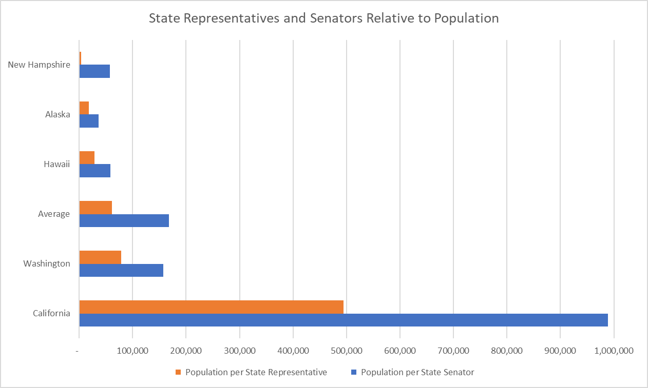
This bar graph focuses on state legislators. It shows the ratios of population to state representative and to state senator. How do the ratios in Alaska compare to those in other states or the national average? What factors might influence how these ratios vary from state to state?
-
Arctic Winter Games
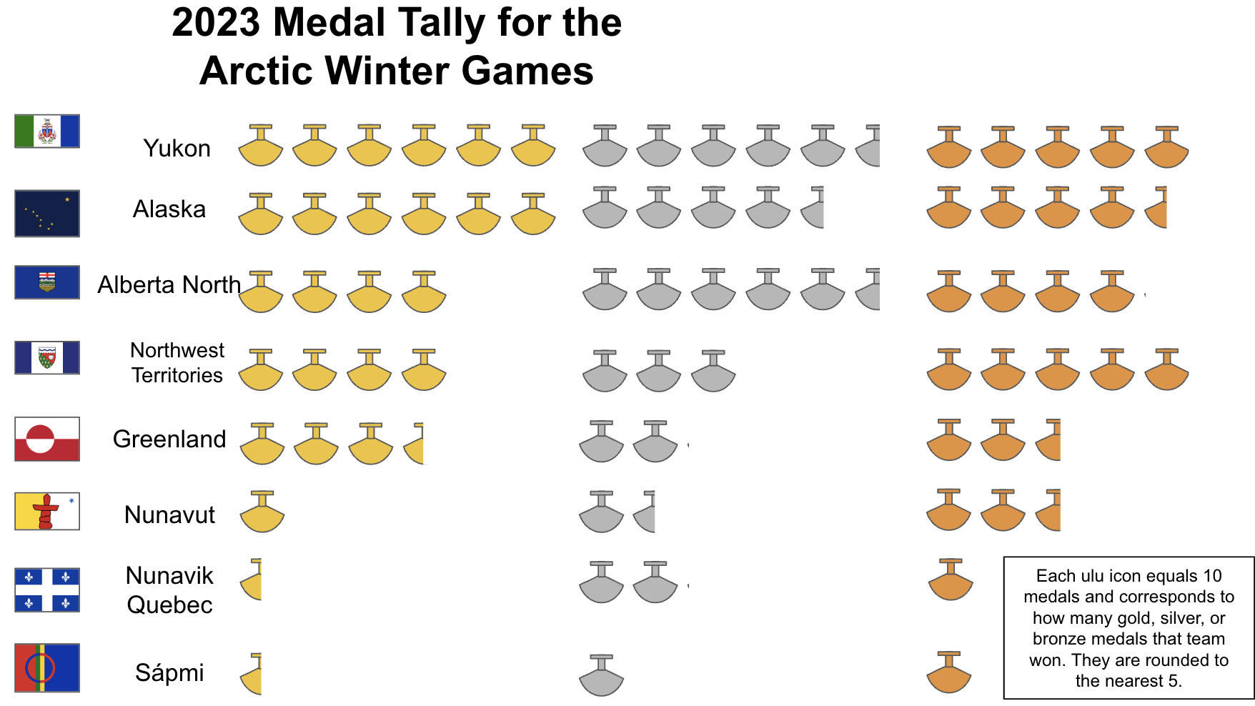
This data shows the medal tallies for the 2023 Arctic Winter Games in a pictographic format. Complete listings are here. There’s a wide range in the number of medals won by each team, from close to 25 total to close to 165 (numbers are approximate because of rounding).
-
Peer Climate
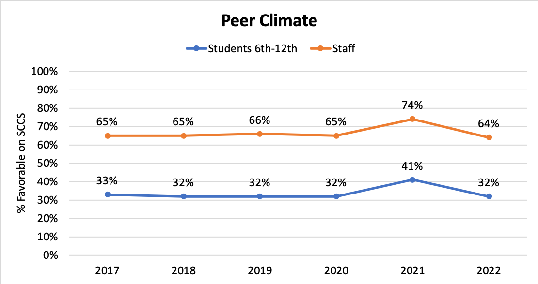
This graph compares how students and staff across Alaska perceive peer climate among students, grades 6-12. Staff perceptions have been consistently 20 percentage points higher than students’, including when they both rose 9 percentage points during the first full year of Covid. What might explain the difference in perception?
-
Inflation and Education Funding
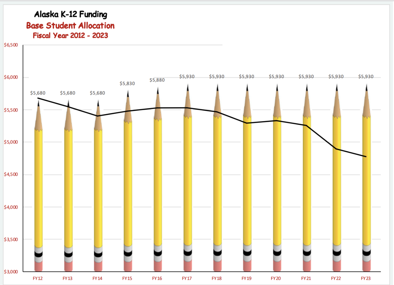
The top graph shows a comparison between Alaska’s K-12 yearly public school funding and the significantly decreased value of that funding due to inflation over the last eleven years, from 2012 to 2023. How should the State of Alaska decide how much money to distribute to the schools for education?
-
Human Migration
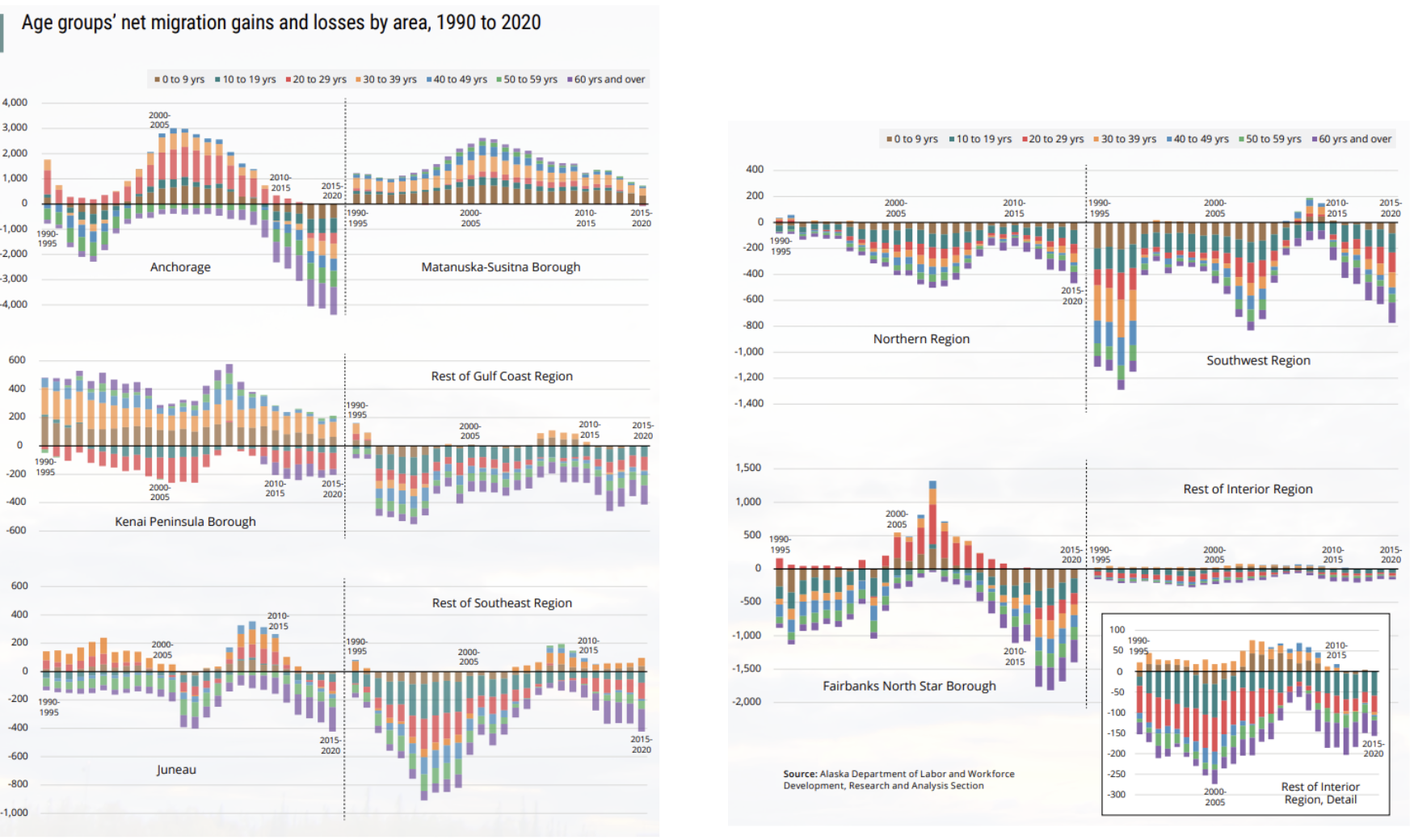
This graph shows how net migration (whether and how many more people have moved in or out) has changed depending on age, time and region of Alaska. The volume of colors and lines can feel quite overwhelming, but there are some clear “big picture” trends and differences to make note of. Mat-Su is the…
-
Representation in STEM Classes
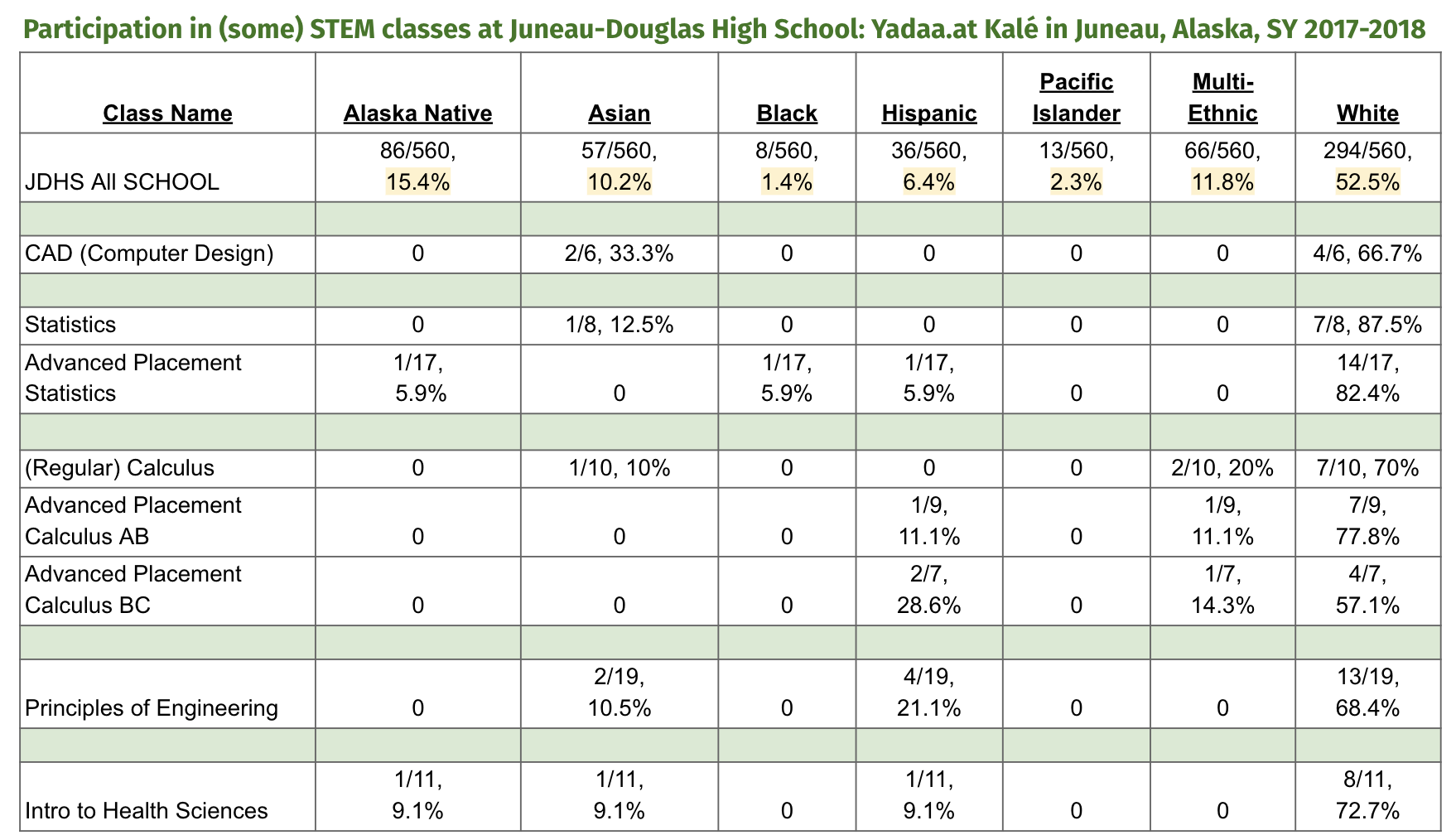
This data shows the demographic makeup of some of the STEM classes at Juneau-Douglas High School: Yadaa.at Kalé in Juneau, Alaska, for the school year 2017-2018. It shows that the percentages of specific races/ethnicities in STEM classes are frequently very different from the percentages in the school as a whole. (Note, this table shows a…
-
Eastern Bering Sea Ecosystem
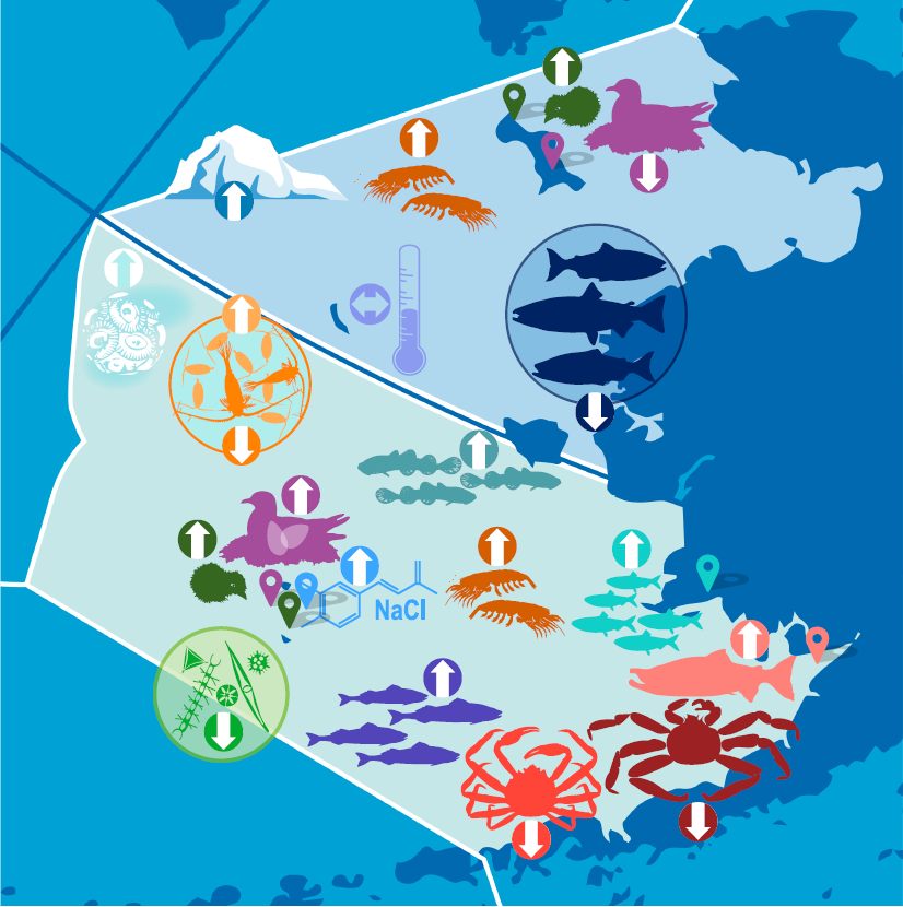
This graphic shows how different aspects of the ecosystem in the Eastern Bering Sea – from temperature to salinity to birds to fish – fared in 2022, relative to ongoing trends (not fashion trends!) Environmental conditions, like ocean temperature, affect plants and animals in different ways. The Bering Sea has been warming and this graphic…
-
Ranked Choice Voting
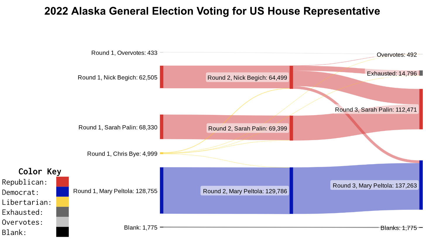
This graphic shows how the ranked choice voting tabulation process worked in the November 2022 Alaska race for US House of Representatives. In the House election, Mary Peltola (Democrat) started off with the most votes, but she had fewer votes than the two Republicans (Nick Begich and Sarah Palin) put together. However, enough of Nick…
-
Triple Dip – Winter Forecasting
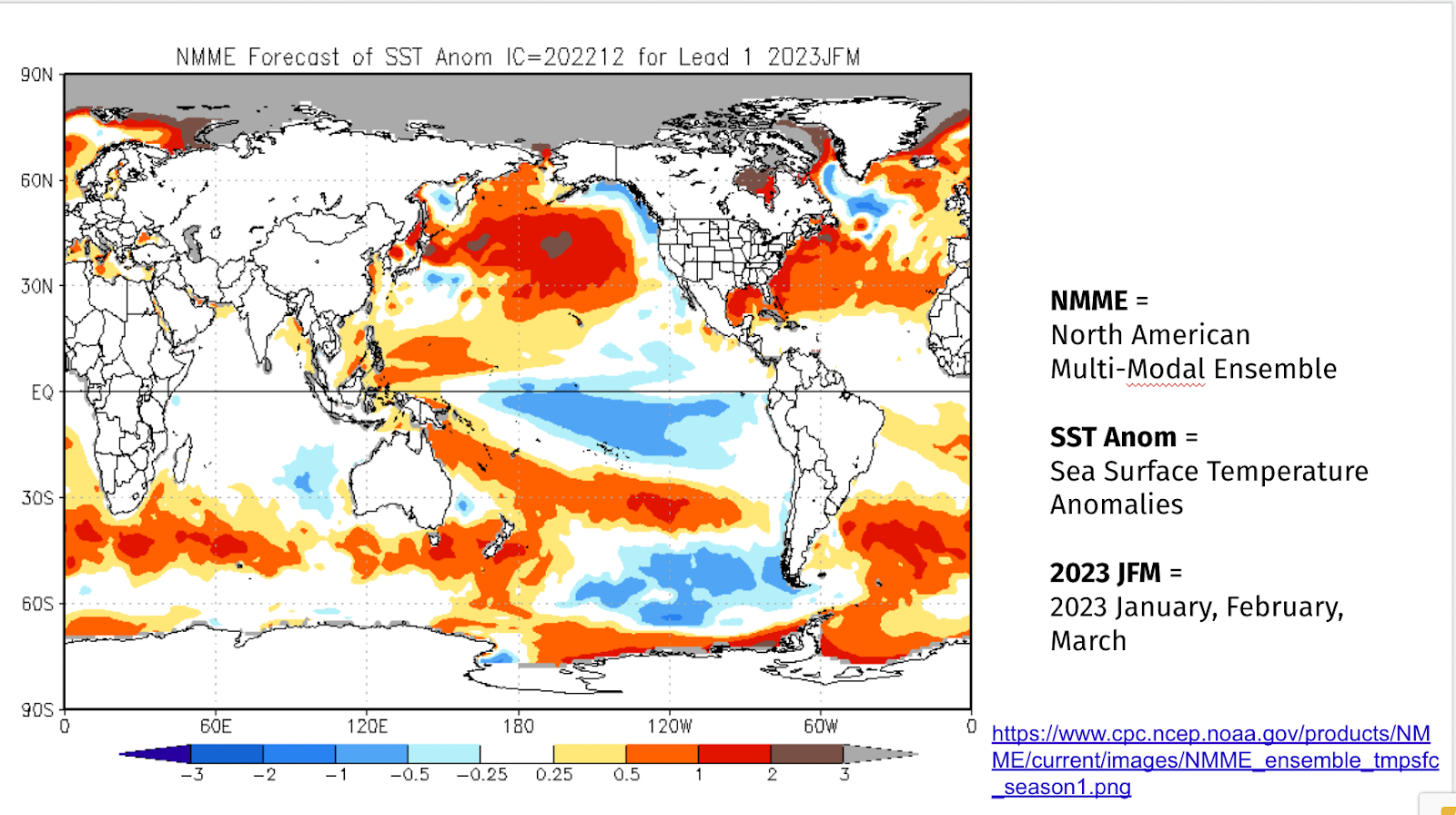
These two graphs show some of how and what NOAA predicts for 2022-2023 winter seasonal outlooks (climate) for precipitation and temperature. The first graph (of projected sea surface temperatures) are a major factor in generating the predictions for the second graph (of predicted temperatures on land.) Overall, the second graphs shows that it is more…
-
Search Trends
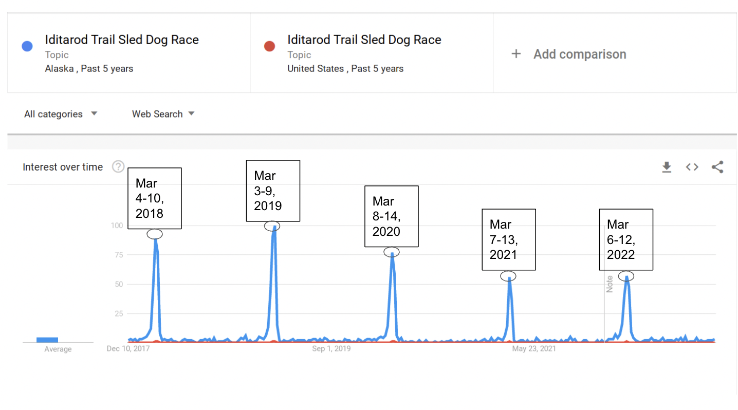
This series of graphs explores trends in internet searches. Google Trends shows search requests made on Google and their relative popularity. We’ve included some of our favorite trends. It’s very easy to make your own that are best suited to your class’s specific interests; see directions below.