
Slow Reveal
Notice, Connect, Wonder
Look at the speaker notes and beginning slides for additional teacher guidance.
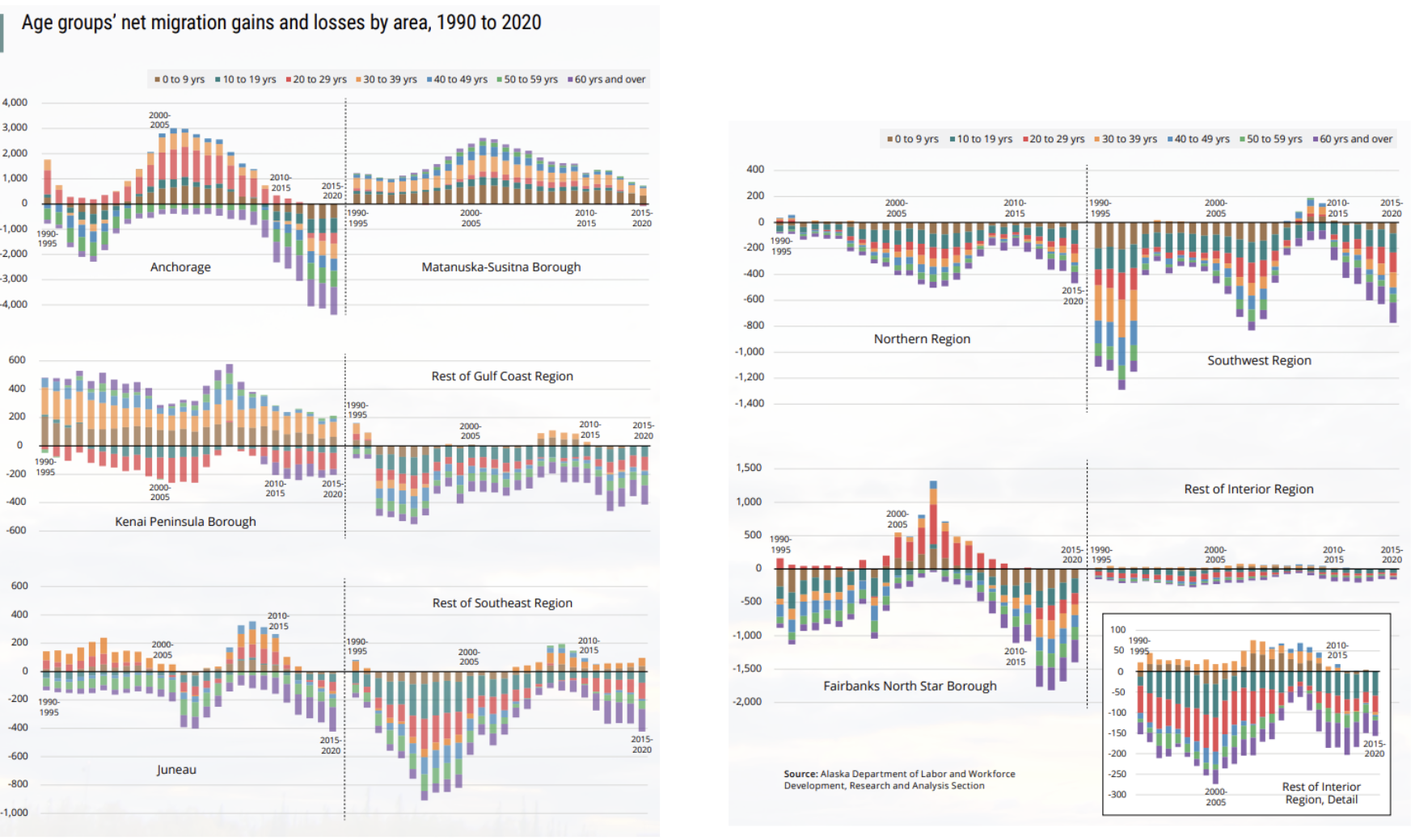
This graph shows how net migration (whether and how many more people have moved in or out) has changed depending on age, time and region of Alaska. The volume of colors and lines can feel quite overwhelming, but there are some clear “big picture” trends and differences to make note of. Mat-Su is the only region that has been growing through all 3 decades. During that same time period, the more geographically distant and less populous regions (Northern, Southwest, and Southeast, Interior and Gulf Coast minus their population centers), and the other population centers (Kenai, Anchorage, Fairbanks and Juneau) have experienced the most consistent outmigration patterns. The population centers have experienced more varied migration – both in and out. Many regions showed a slight bump in in-migration in the late 2000’s which is when the rest of the US was in the midst of the “Great Recession” (beginning in Dec of 2007) and so people from the lower 48 states came to Alaska seeking to jobs; the recession did come to Alaska a few years later.
Among the trends that are harder to see in these graphs, but significant, are that younger people (20’s) move more frequently than those older or younger. That’s not surprising as they are more likely to be moving for jobs and education and to not have reasons to stay put.
Mat-Su’s consistent net in-migration reflects its proximity to Anchorage (for jobs) and its cheaper housing. The wide swings in Anchorage’s population reflect the influx of young people in the early 2000’s and then the impact of the statewide recession in the late 2010s.
In contrast, Kenai has attracted people with young families and those over 60, while 20 somethings have steadily been leaving the region.
A few things to note about these graphs are constructed:
- The y-axis scales differ greatly from graph to graph. The graphic designers decided to emphasize how different the types of changes were (in/out, relatively small/large), rather than focus visually on the actual numbers.
- These graphs don’t give an indication of how the overall population of Alaska was changing during this time.
- The graphs do not take into account how the actual population of these regions of Alaska have changed, i.e., they are not accounting for natural increase (how the population changes because of births and deaths)
- The data is shown in rolling 5 year intervals; generally that makes it easier to see overall trends.
- The economic regions are designated by the Alaska Department of Labor which bases them on 2013 census and borough geography.
Pages 11-15 of the full report from the Department of Labor gives excellent clear summaries and explanations of each region’s changes. Additional pages and graphs examine highlight other important trends and their causes.
Additional Resources:
- Alaska’s population rose slightly in 2022 but more people continue to leave than arrive (James Brooks, Jan 5 2023, Alaska Beacon)
Visualization Type: Stacked Bar Graph
Data Source:
Visualization Source: