
Student suggestions for headlines: “The Truth Behind School,” “Students Know Students Better Than Staff”, “The Aftermath”
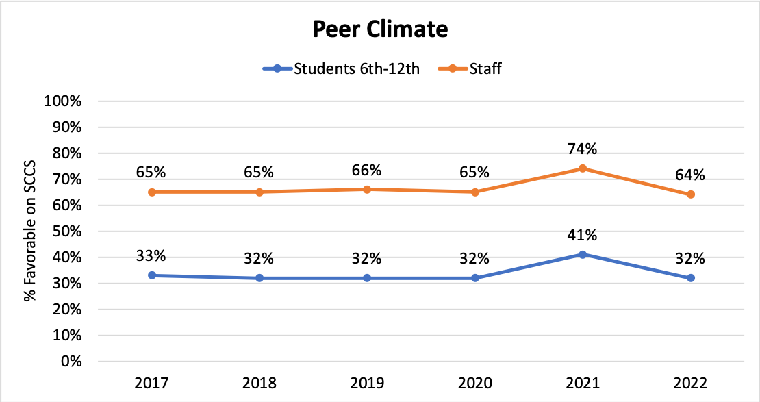
This graph compares how students and staff across Alaska perceive peer climate among students, grades 6-12. Staff perceptions have been consistently 20 percentage points higher than students’, including when they both rose 9 percentage points during the first full year of Covid. What might explain the difference in perception?
Background
These questions are part of the School Climate and Connectedness Survey (SCCS) in which 32 (of 54) Alaskan school districts participate annually between January and March. According to AASB’s handout about the survey, it was developed by the American Institutes for Research (AIR) in partnership with the Association of Alaska School Boards (AASB). It is designed to measure positive school climate, how connected students feel to adults and peers, social and emotional learning (SEL) ,and observed risk behaviors at school or school events. There are two student surveys (grades 3-5 and grades 6-12), one staff survey, and one family survey available to school districts. The collection and analysis of data is carried out by AASB.
Participation is not mandatory and districts pay for the service. Districts who choose not to participate (such as, for instance, Fairbanks), often choose to conduct a similar review of the social and emotional welfare of their students, families and staff. This data represents about 3/5 of Alaskan school districts; those districts, in turn, account for more than 3/4 of the students in Alaska. On average, in each district that participated, about 1/3 of students took the survey, and in each school that participated, about 2/3 of students took the survey (some schools within participating districts did not take the survey). For more detailed numbers, see the slides. For more information about the survey, its goals, and methodology, click here. The complete data can be accessed here at this statewide public link.
Note: Higher “scores” – about any question – reflect more favorable perceptions of peer climate.
This graph
The particular data in this graph about peer climate comes from two sets of questions that students and staff were each asked about how respectful and helpful students are to one another. In addition, the staff set also included questions about how respectful students were to teachers.
Digging into the data
As always, data often prompts more questions even as it answers some.
What might explain the 32 point difference between staff and student ratings?
AASB suggested some possibilities:
- staff my not know about things happening at school between classes
- staff may not know about interactions students are having online/ via text or phone
- staff generally rate things higher than students. While this was suggested, the actual evidence shows that this is NOT TRUE)
Perhaps the actual questions asked of each group make a difference in the ratings. Both staff and students perceive staff/student relationships to be more respectful than student/student relationships, but only the staff set includes a question about staff/student relationships.
- In digging into the specific questions that staff were asked, staff more often scored questions about peer to peer culture lower (51%, 59%, 73%) than peer to staff culture (65%, 72%). If only peer to peer culture were iåncluded, the overall rating by staff would be lower (61%, rather than 64%).
- Similarly, in questions in other sections of the survey, staff and students both rate, “Teachers and students treat each other with respect in this school” very highly at 83% and 73%, respectively.
How much does who is responding, within each group, affect the difference in perception? Note: this document has not done any analysis of how different groups respond to specific questions, only how they respond to the overall set of questions. There are probably interesting observations at that level of specificity – and some that might address some of the questions listed below. Remember that the full results for the state are available here.
Where is the variability among student groups? Any ideas why?
There is the most variability among demographic groupings in “Difficulty getting basic things” (a difference of 11% from most to least likely to report favorably) and in “Grades” (a difference of 10%). Race/Ethnicity shows the least variability (a difference of 7%). In general, there’s a correlation between students in groups who are traditionally marginalized (lower grades, lower SES, younger, non-male) being less likely to rate peer climate favorably compared to those in non marginalized groups, but that is not as indicative with race/ethnicity.
- Difficulty getting basic things for family
- The more likely a student is to report no difficulty, the more positively (33%) they rate peer climate compared to those who do report difficulty (22%). Are students who are already struggling with basic needs at home treated worse by fellow students or are they more aware of and sensitive to how fellow students are treated by other students? Or both?
- Grades
- Students are more likely to perceive peer climate more favorably when they have higher grades (A’s are 34%, mostly D’s and F’s are 24%)
- Gender identification
- Students who identify as male are the most likely to perceive peer climate favorably (34%), in contrast to females (30%) and those who prefer not to answer (25%) or identify in a different way (24%).
- Grade Level
- 12th graders report the most favorable ratings (36%); 8th graders report the least favorable ratings (27%).
- In general, as students enter high school and prepare to graduate, their perceptions of peer climate seem to improve. Do we know, though, what happened to the 8th graders who reported negatively? Did they drop out of school? Did their perceptions change over time?
- Skipping School
- Students who don’t skip school were more likely (34%) to give favorable ratings to peer climate than those who do skip school (26%). Does that reflect that students who have and see less positive relationships with peers have more reason to leave school – or that those who are already leaving school face more negative experiences when they are in school?
- Learning Model
- Similar to the bump in 2021, students who were doing school in 2022 mostly via distance were more likely (39%) to give favorable ratings to peer climate than those doing school in-person (31%).
- Race/Ethnicity
- American Indian (35%), white (34%) and Alaska Native (33%) students were most likely to rate peer climate favorably; students who identified as Black/African American, or two or more races were least likely to rate peer climate favorably (28% and 29%).
- Speaking a language other than English at home
- Note: the difference between those who did and did not speak a second language at home was only 2 percentage points, so we did not include the details in the slides or here.
- When students are considering the SCCS peer climate questions, how much are they rating their own personal interactions with other students and how much are they rating how they see other students treating other students? Would those answers be different?
Where is the variability in staff groups?
- School Role
- Among staff respondents, administrators (72%) were far more likely to say that the peer climate is positive than were classified and certified staff (61% and 64%). Are administrators commenting on a different reality because students are more careful about how they act in front of them?
- Gender Identity
- Similarly, staff who identify as male or female gave higher ratings (65%) to peer climate than those who prefer not to say or who do not identify in that way (47% and 50%, respectively). Does that difference reflect how staff perceive themselves to be treated, how much more aware some teachers are than others to peer culture, or how students act differently in front of different teachers?
- Race/Ethnicity
- Asian (74%) and Native Hawaiian (70%) were most likely to perceive peer climate favorably and Two or more Races (57%) and Alaska Native (58%) were least likely to perceive peer climate favorably. These high and low ratings were more spread out than and differed from student ethnographic ratings.
- Length of Time in District
- Teachers who’d worked the longest in the district (more than 15 years) were somewhat more likely than other teachers to give a favorable rating (68%) than others (lowest were teachers of 6-10 years, 62% of whom gave a favorable rating.) Is that a significant variation? What might explain it? Are more experienced teachers more capable of creating environments where students treat each other and the teacher better?
What might explain the bump in favorability in 2021?
The bump in favorability in 2021 reflects the year of teaching during Covid. (Remember that schools started closing from Covid in March of 2020, after the SCCS was conducted for the year.) Does the increase reflect a change in how the survey was conducted that year (i.e., who participated) and/or how students interacted?
- During 2021, many schools varied their teaching delivery during the year – sometimes being completely online, sometimes offering a hybrid option, sometimes being in person. (Note: these varied teaching deliveries continued in 2022, as noted in the student demographic descriptions).
- In addition, some schools adjusted their schedules so that, for instance, classes were only held 4 days a week and the 5th day was for catch up.
- In person attendance was much lower that year; did students treat each other better because there were fewer of them in classes?
- By all accounts, teachers were aware that students were struggling emotionally and socially that year; did teachers make changes to classroom environments (virtual or in-person) that improved peer culture?
- What else might account for the favorability increase and why did it return exactly to the previous year’s level when school became (more) in-person again?
What questions might you have about how representative this data is? What might AASB or schools do to make this survey and its results even more representative and useful?
The complete data shows (though not in these slides) how many respondents were from each student and staff demographic category and what those corresponding percentages of all respondents were. It does not show, though, how representative the respondents were of the district or state population as a whole. We know that 3/5 of Alaskan school districts participated and that, within those districts overall about 2/3 of students in participating schools took the survey. We don’t know, though, whether there were some grades/genders etc that were under or overrepresented. AASB is working on this analysis, but it is not currently available.
How might this data be used?
We look forward to hearing student suggestions. Below are some examples of how organizations have used this data so far:
- School boards use the results from the SCCS survey to set district priorities
- Some schools look at the survey results as a staff and then use it to set goals and make changes at a school-level
- AASB uses SCCS to measure progress on its goals as an organization, to apply for grants and to measure progress on those grant goals.
- Various other entities – such as the Alaska Department of Education – use the SCCS in a variety of ways. Some, for instance, link school climate to academic achievement or teacher retention, or they look at the impact of programs such as the trauma engaged schools work.
Written by Brenda Taylor, with substantial use of “About Alaska’s School Climate and Connectedness Survey” by AASB and with advice from Lauren Havens and Kami Moore of AASB.
Data Source: Alaska School Climate and Connectedness Survey, 2022
Visualization Source: Alaska Association of School Boards
Additional Resources:
School Climate and Connectedness Survey results, statewide: http://bit.ly/anchoragepublic
“About Alaska’s School Climate and Connectedness Survey” (Alaska Association of School Boards) https://panorama-www.s3.amazonaws.com/clients/alaska/2022/22_About_SCCS_FINAL.pdf
I think we get along pretty well, I don’t know why the staff is 2x higher than the students.
why are staff double the students,
why did 2021 go up
Why is there only 2017-2022 data on the graph?
I noticed that in the graph staff has 2x more than the students. I also wonder why 2021 has a huge spike all of a sudden. Lastly I wonder why the grades is 6th – 12th.
One thing I noticed was the staff’s answers were much higher than the students. Another thing I noticed is that in 2021 we had an increase, and in 2022 it decreased to the percentage that in 2020. The last thing I noticed is that the staff’s answers were two times higher than the students.
one thing I noticed about the graph is that in 2021 the numbers went up. Another thing that I noticed is that the staff is orange and the students are blue. The last thing that I noticed was that 2018,2019,2020 and 2022 are all the same numbers.
The Truth Behind School
I notice that on the y axis there are percents going from 0% to 100%. On the x axis there are years from 2017 – 2022. I wonder why we have that increase in 2021 and not any other year? Why did students rank so low? This graph is on students and teachers in Alaska. Peers and teachers are represented.
Maya,
Your headline is very catchy! 2021 was the big covid year. The survey is given around February usually. I know in Juneau, students had just come back to school for the first time in person a few weeks before the survey. I don’t know about other schools. It surprised me that students and staff rated peer climate better during covid because I thought there’d still be cyber bullying. One student I spoke with thought that maybe everyone was so happy to be back in person that they were on best behavior in 2021. What do you think?
Students in this school don’t treat their peers with respect.
staff doesn’t see the bullying and body shaming that is happening because it normally happens at lunch or in exploratory.
some of the students in middle school are judgemental and the moment a teacher comes in they act as if nothing happened or put the blame on the person they were bullying.
Kristine,
It sounds like you think that the graph accurately represents peer climate at your school – that it’s not respectful and that teachers don’t know what it’s really like. So, maybe this graph could be useful in letting adults know how little they know! What did your teacher think of the graph and of your comments and your classmates’ comments? This makes me do a lot of wondering about could be done to improve the peer climate? More adults everywhere? Students standing up to bullying? Any ideas?
Brenda
Why the heck do the teachers believe that we all get along and are happy? I also noticed that the numbers went up in 2021 and went back down in 2022 why? Why do kids in elementary school not get to take the servery but kids in middle and high school do?
Augustine,
That’s an important question! Could you interview your teacher? What did they think about these results? 2021 was the year of Covid, when lots of schools were virtual for at least some of the year. Kids in elementary school do take the survey (starting at 3rd grade), but they are asked fewer and sometimes different questions. I just looked up their data. They have a question about: “Students here treat me with respect” that 39% reported favorably about. The favorability score goes down from 3rd grade to 5th grade. Did you look at any of the extra details about how the favorability scores 6-12 are lowest in 8th grade? Does that make sense to you?
Brenda
In my opinion I think why staffs graph is higher then students is because staff does not see the things that students do. Example, i’m in class and I go get a drink of water and I see two student bulling a nether student, or at lunch I see two students bulling a student. students know students better then staff.
Lexus,
I don’t know whether you meant to say that “Students know students better than staff” is your idea for a headline, but it sounds like one that sums up your ideas about peer climate; I’ll add it to the top of the website. Your examples are super helpful as evidence for making your point. Any ideas for how to make things better? I know that these numbers combined with the examples from you students are showing me things that I didn’t know – and making it clear that things should change.
Brenda
-I noticed staff believe students get along more than students think they get along.
-Why does it decrease in 2022
-It affects us
-Students & Staff Results.
Staff believe students get along more than students believe they do. In fact the staff believe two times more than the students do. Why was there an increase in 2021 but then in 2022 it went back to what it was before.
Hannah,
What was happening in 2021 that would have impacted schools and students being in schools?
Any ideas why students and staff see peer climate so differently?
Brenda
1. how come the graph of the students and staff increased then decreased?
2. why did the graph in the beginning year 2017 and 2018 for staff stayed the same but for the students, it decreased by one?
3. that staff went up to 60-70 and students 30-40.
why has 2021 inceres so far up? It’s weird how it was better in 1/2 and 1/2 of the school. why is the staff higher than the students and wats with the blue and orange
The percentages for students and staff increased in 2021, maybe due to distance learning
The percentages for staff are much higher than students, maybe due to staff only watching
Staff think students get along more than students think they do, probably because they are observing
Ty,
I’m also assuming that distance learning – or being fresh back in school after distance learning is what changed the favorability ratings. Do you think there’s anything that staff did in 2021 to support better peer climate? What do you think staff could do to support per climate now?
Brenda
Staff believe students get along more than students say so.
Something that stood out to me is why was the students rate so low?
One other thing that stood out to me was in 2021 it increased and in 2022 it decreased?
Camille,
It’s striking how differently staff and students perceive; isn’t it? What do you think should be done with this data? What could staff – including principals, etc – do improve peer climate at your school?
Brenda
Why did it increase in 2021?
Why is the student rate so low?
Staff are two times higher than students.
Staff believes students get along more than students think they do. Staff 2X higher than students. 2021 increase for staff and students.
I noticed that the one in 2022 is twice as high on that STAFF section than the students section. Why is the rate in the student section noticeably low? And why is the rate from 2018-2020?
I notice way different percentages between the staff and students. I also notice the increase in 2021. I wonder why the staff is 2x higher.
I noticed that both the lines really had no major change until 2021. I think that is from COVID-19 and they were glad to be back so they treated each other more nicely. The staff also had higher ratings. Probably because teachers and staff did not know what was really going on.
Why do the teachers think we student get along better than we think?
How came up with the idea to do this graph ?
Dose the state help with the graph or is it just you guys? Not in a rude way you guys are awesome!
Icey,
Thanks for all the questions!! I think your classmates have lots of answers for the first one; I’m reading through all their comments about how much happens when teachers and other adults aren’t aware :(.
The idea for this graph came from people at the Alaska Association of School Boards (AASB). They’re the ones who send out and then analyze the School Climate and Connectedness Survey every year — that’s where this data comes from. We explained this What’s Going On In This Alaska Graph project to them and they were excited to participate. As I said, they do these surveys every year and share the data with the adults (mostly administrators and school board people), but don’t have a chance to share the data with the students themselves and so are thrilled to have a way to do that through this project.
When they create graphs for administrators, usually it’s just showing one point of view. They made this one with staff and students on the same graph especially for this project. They’re the ones who chose Peer Climate to share with you. I’m guessing because they’re as frustrated as you about bullying among students and are hoping that maybe, just maybe, these numbers will help make a change.
We took AASB’s graph, put it into slides, and asked lots of questions about the numbers, etc., to write up lots of background information for teachers and anyone else who’s curious (it’s all on this website if you want to look at it – or look at the data about other questions.)
We love to hear what you all are interested in seeing graphs of. Please send us ideas!! And, if you want to know more about this survey and results, the AASB people would be very happy to visit or email with you. Put your ideas in these comments 🙂
Thanks,
Brenda
Something that I wonder is why students and staff both get higher percentages when the line goes high and then low. Also, I wonder why students see more things happening to other students than teachers. Why do students not allow other students to be their friends.
Barron,
I agree that’s it interesting how staff and students always stay the same distance apart, even when favorability is going up and down. Any ideas about what anyone – staff/students/families/school board – could do to improve peer climate? Could this data be used to make a difference?
I notice that the staff of schools in Alaska rate a lot higher than students do. I also wonder why they made this graph in 2017, was there something crazy that happened during that time that made it? Why did students rate 2017-2019 and 2022 all 32%?
Anyeeyah,
That’s an interesting question about why the graph starts in 2017. I think the answer is that that’s the year that the people who do this survey and graph – the Alaska Association of School Boards – changed the grouping of questions for what was part of “Peer Climate” for both staff and students. Although Covid started in March of 2020, that was after the survey had been done for 2020, so it didn’t affect the scores. The next year, though, 2021 Covid was still impacting schools a lot – some schools were completely virtual, some hybrid, some changed in the middle of the year. It’s interesting that all those changes actually improved peer climate scores. Any ideas why?
Brenda
I really noticed that in 2021 the score for both staff and students went up. I still wonder why staff thinks so much more kindness and help is being spread more than kids think it is. I wonder why kids post more bad things than staff.
I wonder
why the staff are double
Why did 2021 increase and
are the students hanest
Owen,
The staff does rate so much more favorably than students. I’m intrigued by your question about student honesty. Do you think students exaggerate and say that peer climate is worse than it is; if so, why would they do that? In another class, some students said that they think one problem is that lots of students don’t take the survey (School Climate and Connectedness Survey) seriously and just answer as quickly as they can, maybe not paying attention to what they’re saying.
Thanks for getting me thinking 🙂
Brenda
I notice that there are years on the bottom of the graph and there are also percentages on the dots. and that in 2021 it went pretty high because everybody was in quarantine.
Some things that stood out to me is that 2021 had a huge increase. I also noticed that the X axis = years. Finally, I wonder if the graph is completely honest.
I notice that teachers were higher they got along better and they saw things that were not true or off about the problem. Maybe they should try to see the kid’s side of what happened and if they weren’t so rude then they have a better relationship with the students. Also they should try to have a better teaching skill
I noticed, that the staff line (orange) was a lot higher then the students line (blue) which was the students. I think this has to do with the topic that the students don’t want to get in trouble with the teacher or staff that is around at the time. So the students act like nothing is happening so they wont get in trouble. These are some reasons why I think that the staff line is higher.
I think we get along ok. why is staff 2x higher than students? Why 2017 to 2022? Is it honest?
did great
I wonder why the staff is 2x higher than the students in how they think they treat each other.
I noticed that the colors and blue for the students and orange for the teachers.
I think a good head line would be ” the after math ” because teachers see them getting along differently then the students reality.
why do students rate so low, that teachers are so high, that teachers are the orange on the graph and blue are the students on the graph I noticed that it only goes from 2017 to 2022
I noticed, staff rated students two times higher than students did. I wonder why staff rated students two times higher than students. I connect to this graph because I did this survey and I live in Alaska.
I wonder why the staffs answers were 2 times higher then the student? I also wonder if the poeple that answerd these questions if they were honest? whos idea was it to make this graph and why did they think it was so important?
I notice different percentages, different dates, and different colors. Why are staff 2x higher?
Why did 2021 increase?
🙁
:\