State Representation

Notice, Wonder, Connect
Slow Reveal

This bar graph focuses on state legislators. It shows the ratios of population to state representative and to state senator.  How do the ratios in Alaska compare to those in other states or the national average?  What factors might influence how these ratios vary from state to state?

As seen in this graph, the proportion of population to legislators tends to increase as the population size of the state increases (California has the largest population and the largest proportion) but this is not always the case. Alaska’s population is the third smallest (after Wyoming and Vermont), but its proportion of population to senators is the 7th smallest and its proportion of population to representatives is 10th smallest.  

The United States has a federalist government. This means the powers are shared between a federal government and a state government. While we often spend time talking about the federal government, the state government plays an equal (and in many ways, greater) role in your day-to-day life. Like the federal government, most states have a legislature with two chambers (called a bicameral legislature). The one exception is Nebraska which only has state senators and no state representatives (called a unicameral legislature).

Both the federal government and state governments have to find a balance when deciding the size of their legislative bodies. A larger body means more representation and potentially more different voices heard but also could mean too many people talking, more money spent on salaries, and more elected officials to keep track of. Each state decides how it wants to handle this issue, but, generally, as the population of a state increases, so does the number of representatives it has. That rise is usually not linear. As the population increases, the number of representatives normally increases at a slower and slower rate until it stops altogether. This means more people being represented by a single legislator. We can look at the proportion of the number of people per representative to see how large an average district is within a state.

The writers of the U.S. The Constitution believed a ratio of 30,000 people per 1 representative was the proper balance for federal representation. Now, that ratio is over 25 times larger.  The United States was much more rural at its founding and so 30,000 people covered a much larger geographic area than now. Also, communication technology was much less advanced, so larger areas had less frequent communication than they do now. Taking those factors into consideration, what do you think of the current ratio for federal representation?  Is 30,000:1 still the proper balance for federal representation?  What about for state legislatures?

What other solutions do you think would help balance representation and the size of the legislature?

Data Source: https://ballotpedia.org/Population_represented_by_state_legislators

Reproduce the graph yourself or pick different states using the spreadsheet below.

Additional Resources

Arctic Winter Games

Slow Reveal
Notice, Wonder, Connect

This data shows the medal tallies for the 2023 Arctic Winter Games in a pictographic format.  Complete listings are here.  There’s a wide range in the number of medals won by each team, from close to 25 total to close to 165 (numbers are approximate because of rounding).

There are a variety of possible reasons for why some teams win more medals:

  • Some teams are bigger than other teams
    • The population pools are larger for some teams
    • There are more than 730,000 people in Alaska and fewer than 14,500 in Nunavik.
  • Distance from home to location of the Games is closer and it’s easier for more athletes to travel
  • Some teams can afford to bring more athletes because of the cost of:
    • Transportation to the Games
    • Uniforms, equipment
    • Food and lodging during the Games
  • Athletes from some teams are better prepared in some sports
    • Training knowledge and experience is greater in some some communities than in others
    • On-going financial support for all or some sports varies and impacts:
      • What kinds of sports facilities, training, equipment are available back home, when, and for whom
  • The number of events in different sports varies considerably.
    • There are two or three events in most team sports such as Basketball, Curling or Volleyball.  In contrast, there are multiple events in individual sports such as Arctic Sports (35), Wrestling (25), Dene (24) and Cross Country Skiing (24).
ContingentPopulation 
Alaska733,583
Northern Alberta386,000 (2011)
Sápmi(Sámi people of Sápmi region; northern Scandinavia)Unknown.  Estimates range from 50,000-135,000
Greenland56,562
Northwest Territories45,605
Yukon43,789
Nunavut40,526
Nunavik14,405 (2021)

The contingent with the largest population, Alaska, took home the second most medals.  The team with the most medals, Yukon, is the contingent with the third smallest population.  

Additional Resources:

Alaska Well-represented at 2023 Arctic Winter Games in Canada (Alaska News Source)

Juneau Athletes Represent at First Arctic Winter Games Since 2018 (KTOO)

Arctic Winter Games Catalog

Interactive Medal Standings

Peer Climate

Student suggestions for headlines: “The Truth Behind School,” “Students Know Students Better Than Staff”, “The Aftermath”

Slow Reveal

Notice/Wonder/Connect

This graph compares how students and staff across Alaska perceive peer climate among students, grades 6-12.  Staff perceptions have been consistently 20 percentage points higher than students’, including when they both rose 9 percentage points during the first full year of Covid.  What might explain the difference in perception?

Background

These questions are part of the School Climate and Connectedness Survey (SCCS) in which 32 (of 54) Alaskan school districts participate annually between January and March.  According to AASB’s handout about the survey, it was developed by the American Institutes for Research (AIR) in partnership with the Association of Alaska School Boards (AASB). It is designed to measure positive school climate, how connected students feel to adults and peers, social and emotional learning (SEL) ,and observed risk behaviors at school or school events.  There are two student surveys (grades 3-5 and grades 6-12), one staff survey, and one family survey available to school districts.  The collection and analysis of data is carried out by AASB.  

Participation is not mandatory and districts pay for the service.  Districts who choose not to participate (such as, for instance, Fairbanks), often choose to conduct a similar review of the social and emotional welfare of their students, families and staff.  This data represents about 3/5 of Alaskan school districts; those districts, in turn, account for more than 3/4 of the students in Alaska.  On average, in each district that participated, about 1/3 of students took the survey, and in each school that participated, about 2/3 of students took the survey (some schools within participating districts did not take the survey). For more detailed numbers, see the slides.  For more information about the survey, its goals, and methodology, click here.  The complete data can be accessed here at this statewide public link. 

Note: Higher “scores” – about any question – reflect more favorable perceptions of peer climate. 

This graph

The particular data in this graph about peer climate comes from two sets of questions that students and staff were each asked about how respectful and helpful students are to one another.  In addition, the staff set also included questions about how respectful students were to teachers.  

Digging into the data

As always, data often prompts more questions even as it answers some.  

What might explain the 32 point difference between staff and student ratings?

AASB suggested some possibilities:

  • staff my not know about things happening at school between classes
  • staff may not know about interactions students are having online/ via text or phone
  • staff generally rate things higher than students.  While this was suggested, the actual evidence shows that this is NOT TRUE)

Perhaps the actual questions asked of each group make a difference in the ratings. Both staff and students perceive staff/student relationships to be more respectful than student/student relationships, but only the staff set includes a question about staff/student relationships.  

  • In digging into the specific questions that staff were asked, staff more often scored questions about peer to peer culture lower (51%, 59%, 73%) than peer to staff culture (65%, 72%).  If only peer to peer culture were iåncluded, the overall rating by staff would be lower (61%, rather than 64%). 
  • Similarly, in questions in other sections of the survey, staff and students both rate, “Teachers and students treat each other with respect in this school” very highly at 83% and 73%, respectively.

How much does who is responding, within each group, affect the difference in perception?  Note: this document has not done any analysis of how different groups respond to specific questions, only how they respond to the overall set of questions.  There are probably interesting observations at that level of specificity – and some that might address some of the questions listed below.  Remember that the full results for the state are available here.

Where is the variability among student groups? Any ideas why? 

There is the most variability among demographic groupings in “Difficulty getting basic things” (a difference of 11% from most to least likely to report favorably) and in “Grades” (a difference of 10%).  Race/Ethnicity shows the least variability (a difference of 7%). In general, there’s a correlation between students in groups who are traditionally marginalized (lower grades, lower SES, younger, non-male) being less likely to rate peer climate favorably compared to those in non marginalized groups, but that is not as indicative with race/ethnicity. 

  • Difficulty getting basic things for family
    • The more likely a student is to report no difficulty, the more positively (33%) they rate peer climate compared to those who do report difficulty (22%).  Are students who are already struggling with basic needs at home treated worse by fellow students or are they more aware of and sensitive to how fellow students are treated by other students?  Or both?
  • Grades
    • Students are more likely to perceive peer climate more favorably when they have higher grades (A’s are 34%, mostly D’s and F’s are 24%)
  • Gender identification
    • Students who identify as male are the most likely to perceive peer climate favorably (34%), in contrast to females (30%) and those who prefer not to answer (25%) or identify in a different way (24%).
  • Grade Level
    • 12th graders report the most favorable ratings (36%); 8th graders report the least favorable ratings (27%).  
    • In general, as students enter high school and prepare to graduate, their perceptions of peer climate seem to improve.  Do we know, though, what happened to the 8th graders who reported negatively?  Did they drop out of school?  Did their perceptions change over time?
  • Skipping School
    • Students who don’t skip school were more likely (34%) to give favorable ratings to peer climate than those who do skip school (26%).  Does that reflect that students who have and see less positive relationships with peers have more reason to leave school – or that those who are already leaving school face more negative experiences when they are in school?
  • Learning Model
    • Similar to the bump in 2021, students who were doing school in 2022 mostly via distance were more likely (39%) to give favorable ratings to peer climate than those doing school in-person (31%). 
  • Race/Ethnicity
    • American Indian (35%), white (34%) and Alaska Native (33%) students were most likely to rate peer climate favorably; students who identified as Black/African American, or two or more races were least likely to rate peer climate favorably (28% and 29%). 
  • Speaking a language other than English at home
    • Note: the difference between those who did and did not speak a second language at home was only 2 percentage points, so we did not include the details in the slides or here. 
  • When students are considering the SCCS peer climate questions, how much are they rating their own personal interactions with other students and how much are they rating how they see other students treating other students?  Would those answers be different?

Where is the variability in staff groups?

  • School Role
    • Among staff respondents, administrators (72%) were far more likely to say that the peer climate is positive than were classified and certified staff (61% and 64%).  Are administrators commenting on a different reality because students are more careful about how they act in front of them? 
  • Gender Identity
    • Similarly, staff who identify as male or female gave higher ratings (65%) to peer climate than those who prefer not to say or who do not identify in that way (47% and 50%, respectively).  Does that difference reflect how staff perceive themselves to be treated, how much more aware some teachers are than others to peer culture, or how students act differently in front of different teachers?
  • Race/Ethnicity
    • Asian (74%) and Native Hawaiian (70%) were most likely to perceive peer climate favorably and Two or more Races (57%) and Alaska Native (58%) were least likely to perceive peer climate favorably.  These high and low ratings were more spread out than and differed from student ethnographic ratings.
  • Length of Time in District
    • Teachers who’d worked the longest in the district (more than 15 years) were somewhat more likely than other teachers to give a favorable rating (68%) than others (lowest were teachers of 6-10 years, 62% of whom gave a favorable rating.)  Is that a significant variation?  What might explain it?  Are more experienced teachers more capable of creating environments where students treat each other and the teacher better?  

What might explain the bump in favorability in 2021?

The bump in favorability in 2021 reflects the year of teaching during Covid.  (Remember that schools started closing from Covid in March of 2020, after the SCCS was conducted for the year.)  Does the increase reflect a change in how the survey was conducted that year (i.e., who participated) and/or how students interacted? 

  • During 2021, many schools varied their teaching delivery during the year – sometimes being completely online, sometimes offering a hybrid option, sometimes being in person. (Note: these varied teaching deliveries continued in 2022, as noted in the student demographic descriptions). 
  • In addition, some schools adjusted their schedules so that, for instance, classes were only held 4 days a week and the 5th day was for catch up. 
  • In person attendance was much lower that year; did students treat each other better because there were fewer of them in classes? 
  • By all accounts, teachers were aware that students were struggling emotionally and socially that year; did teachers make changes to classroom environments (virtual or in-person) that improved peer culture?  
  • What else might account for the favorability increase and why did it return exactly to the previous year’s level when school became (more) in-person again?  

What questions might you have about how representative this data is? What might AASB or schools do to make this survey and its results even more representative and useful?

The complete data shows (though not in these slides) how many respondents were from each student and staff demographic category and what those corresponding percentages of all respondents were.  It does not show, though, how representative the respondents were of the district or state population as a whole.  We know that 3/5 of Alaskan school districts participated and that, within those districts overall about 2/3 of students in participating schools took the survey.  We don’t know, though, whether there were some grades/genders etc that were under or overrepresented.  AASB is working on this analysis, but it is not currently available.

How might this data be used?

We look forward to hearing student suggestions.  Below are some examples of how organizations have used this data so far:

  • School boards use the results from the SCCS survey to set district priorities
  • Some schools look at the survey results as a staff and then use it to set goals and make changes at a school-level
  • AASB uses SCCS to measure progress on its goals as an organization, to apply for grants and to measure progress on those grant goals.
  • Various other entities – such as the Alaska Department of Education – use the SCCS in a variety of ways.  Some, for instance, link school climate to academic achievement or teacher retention, or they look at the impact of programs such as the trauma engaged schools work.

Written by Brenda Taylor, with substantial use of “About Alaska’s School Climate and Connectedness Survey” by AASB and with advice from Lauren Havens and Kami Moore of AASB. 

Data Source: Alaska School Climate and Connectedness Survey, 2022

Visualization Source: Alaska Association of School Boards

Additional Resources:

School Climate and Connectedness Survey results, statewide: http://bit.ly/anchoragepublic

“About Alaska’s School Climate and Connectedness Survey” (Alaska Association of School Boards) https://panorama-www.s3.amazonaws.com/clients/alaska/2022/22_About_SCCS_FINAL.pdf

Representation in STEM Classes

Slow Reveal
Notice, Connect, Wonder

This data shows the demographic makeup of some of the STEM classes at Juneau-Douglas High School: Yadaa.at Kalé in Juneau, Alaska, for the school year 2017-2018.  It shows that the percentages of specific races/ethnicities in STEM classes are frequently very different from the percentages in the school as a whole. (Note, this table shows a few select classes.  The analysis below refers both to the data in this table and to the data from the complete table, which is available here.) More specifically, it is most frequently the white students who are overrepresented in the STEM classes and the other groups that are somewhat or very underrepresented; for instance, there are 0 Alaska Native students in calculus or engineering, even though they make up 15% of the school population.  Why is this like this and does it matter?  

It matters because anytime there’s a big discrepancy between school-wide and class-specific enrollment, it’s worth trying to understand why it’s happening and what potential consequences there might be.  The why is complex and some possibilities are suggested below. The consequences in this case are dramatic; taking STEM classes correlates with majoring in STEM subjects in college which is, in turn, necessary for most STEM occupations.  Currently, STEM occupations are generally both more highly paid than other occupations and less representative of the general population. That means that the work done in those fields does not benefit from a diversity of experience and point of view and so work is done “for” or “about” people by other people who do not have the relevant and necessary background (e.g., male engineers making products for females). Furthermore, the wealth of STEM fields is concentrated in certain groups (especially white men).  For example, as slide 18 shows, on the whole, white and Asian men in STEM jobs make considerably more than men of other races or women – so much so that Asian men are likely to make nearly twice as much as, for instance, Hispanic women.  

Some of the additional slides show the differential representation in STEM classes of other groups: male and female (no other identification of gender was available then), socioeconomic status (through free and reduced lunch), and of 9th grade math classes. At JDHS: Yadaa.at Kalé, females are generally overrepresented in the natural sciences and underrepresented in physical sciences, technology, and the highest level math courses. The greatest gender differences are in Principles of Engineering (5% female) and Intro to Health Sciences (91% female), which, not surprisingly, corresponds with the differences in which STEM occupational groups women are overrepresented (74% in health-related) or underrepresented (15% in engineering).  Free and Reduced Lunch representation is egregiously low or nonexistent throughout all but one STEM class (one year of Oceanography when it was a few percentage points higher than the general population).  And, there are also very sharp distinctions visible in the math preparation for different classes.  Enrolling in the STEM classes which are often a prerequisite for college STEM classes (Physics, Chemistry, upper level math, upper level biology) is highly correlated with having already completed algebra in 8th grade, prior to high school. (Remember, to see the complete data, go here.)

Why are white students so overrepresented in STEM classes and free and reduced lunch students so under enrolled?  There are no simple answers, but lots of pieces.  What level a student came to 9th grade is clearly indicative.  How is it that white students are so over represented in 8th grade algebra?  (slide 17)  They are also overrepresented in Gifted & Talented education – the testing for which is usually done in 3rd grade.  It’s been known for a long time that the testing for G&T is unfair, but no substantial changes have been made.  Participation in math classes is determined by teachers – and by some parents who may influence class assignments by paying for tutors and/or lobbying the administration for specific classes. In addition, some parents are able to pay for their children to take supplemental online courses to advance them along the math levels. Another factor is that math is often a class where homework is emphasized and where different families are more or less able to support their children with their homework. Students whose families do not have extra funds or are not themselves confident in math are at a disadvantage in being in more advanced math classes.

The data was culled from PowerSchool by the principal as part of that school’s Equity project. It was shared with the school teachers in a staff meeting and with the Juneau community through the local newspaper.  Data was also collected the following year for comparison’s sake (here). Because these classes are quite small, one student – especially from a marginalized group – can make a big difference in the data in the representation. For example, there’s not enough data to conclude that there’s a trend for black students to be more likely to take AP Statistics. Cumulatively, however, across classes, across marginalized groups, and over the two years, the pattern of underrepresentation is clear.) These data are certainly not unique to JDHS:Yadaa.at Kalé or to Juneau; we hear about similar patterns of underrepresentation of marginalized groups in certain classes throughout the US. 

Race, ethnicity and gender labels were taken from PowerSchool, which means that families chose those categories from the choices available.  Families could choose only one race category (Asian, Black, Multi-Ethnic, Alaska Native/American Indian, Hispanic or White).  Free and Reduced lunch data is also entered into PowerSchool, via the collection of paperwork required for Free and Reduced Lunch. Other demographic tags regarding special programs (English Learners, Extended Learning and Special Education) were not included, in part to allow for specific analysis regarding Race, Ethnicity, Gender and Socioeconomic patterns (if there were any). 

We want to be clear that these numbers do not reflect the inherent ability or potential of any individual students or of any group(s) of students. We know that it can be difficult, especially for the students from these underrepresented groups, to see this data and that there may be a range of emotions: sadness, anger, bravado, disbelief, etc.  We think that it’s important to share this data, talk about it, think about what factors have contributed to it, and work to make sure that these inequities do not continue into the future.

A very real danger in collecting and presenting data this way is that it might be incorrectly interpreted to say that, for instance, girls don’t enroll in Engineering because they’re not “good at” and “can’t do” Engineering.  That is simply untrue; both societal messages and actual practices and policies have created these disparities.  Another, contrasting, challenge is that students in the underrepresented groups may feel that the message of this data or this article is that they, as individuals, “have to” go into STEM fields – even if they don’t want to. That is also not the intention of this analysis.  Our point is that all students deserve the same opportunities to explore and learn so that they can make their own, independent, choices and we, as adults, have a tremendous responsibility to constantly be analyzing those opportunities and surrounding context to make them more and more equitable.  

What questions are you left with about the school data around you?

What other student/school data do you think students (and families) should be interacting with?

What other data could be gathered to understand and then address these unequal representations?

Slideshow and “reveal” analysis developed and written by Brenda Taylor, Juneau STEM Coalition, with some advising by Paula Casperson, JDHS: Yadaa.at Kale principal.

Additional Resources:

Visualization Type: Table

Data Source:

Visualization Source:

Ranked Choice Voting

Slow Reveal
Notice, Wonder, Connect

This graphic shows how the ranked choice voting tabulation process worked in the November 2022 Alaska race for US House of Representatives. In the House election, Mary Peltola (Democrat) started off with the most votes, but she had fewer votes than the two Republicans (Nick Begich and Sarah Palin) put together. However, enough of Nick Begich’s voters wanted Mary Peltola over Sarah Palin, that when he was eliminated, Peltola won. Meanwhile, the Senate saw a different situation. Lisa Murkowski and Kelly Tshibaka are both Republicans and far and away had more votes than the Democrat (or the third Republican). Neither had over 50% though. After two rounds of elimination, Lisa Murkowski won. In both of these races, the candidate who had the most votes in the first round ended up winning. The difference is that in the House race, the Republican candidates combined had more votes, but enough wanted the Democrat over the other Republican, that it changed the outcome. Meanwhile in the Senate, the Democrat had many fewer votes but when she was eliminated her votes decided which of the Republican candidates would win. In both these scenarios, ranked choice voting provided more opportunity for voters to express their preference for candidates.

Beginning in the summer of 2022, Alaska switched to a ranked choice voting system. In ranked choice voting, voters rank candidates. There are multiple types of ranked choice voting, but Alaska uses instant-runoff voting. In round one of the counting, each candidate starts with however many voters ranked them #1. If no candidate has received more than 50% of the vote, then the candidate with the fewest votes is eliminated and all their votes are distributed to each voter’s second pick. This process is repeated until one candidate has over 50% of the vote. In some cases, there is no elimination process because one candidate wins in the first round. In November, 2022, for instance, Dunleavy received over 50% of the round one votes in the Alaska governor’s race so he immediately won. However, the statewide races for U.S. Senate and House both required two rounds of elimination to reach a candidate. 

There are many decisions made when designing a voting system. For example, Alaska starts with a primary. In that primary, voters only select one candidate. The top four candidates advance to the general election where instant-runoff voting occurs. All of these decisions impact the outcome of the election. Instant-runoff voting encourages a candidate to have broad appeal even if their supporters are not very enthusiastic about them. A candidate needs to get at least 50% of people to have voted for them, but they could have been a voter’s second or third choice. Meanwhile in a first-past-the-post system like most of the United States uses, a candidate needs to have the most supporters who feel strongly enough about them to pick them over everyone else even if that is still a minority of the voters in the area. Alaska tries to balance these tradeoffs by having the four general election candidates be picked by first-past-the-post and the winner be selected by ranked choice.

Additional Resources:

Visualization Type: Sankey Diagram

Data Source: Alaska Division of Elections

Visualization Source: Craig Fox using SankeyMatic

This graphic can be replicated with different data with some effort and minimal technical skill. Election data must be retrieved from Alaska’s Division of Elections and manually entered into SankeyMatic. The text entered to create these visualizations can be found below

Search Trends

Slow Reveal
Notice, Wonder, Connect

Suggested Student Headlines: “Iditarod Search Trends in Alaska, What Do They Tell Us?”, “How Spikes Affect Us Most,” “The Trends of Your Home State Compared to the Rest of the United States,” “The Downfall of the Iditarod,” “Iditarod: Interesting Here Unknown There,” “How Popular is Sled Dog Racing?” “National Park Searches; Are They Popular or Not?”

This series of graphs explores trends in internet searches. Google Trends shows search requests made on Google and their relative popularity. We’ve included some of our favorite trends. It’s very easy to make your own that are best suited to your class’s specific interests; see directions below.

On each graph, the popularity of something is divided by the total number of searches in that area and time period and is scaled so the highest point is 100 and everything else is below that.  Google does some other filtering as well. Topics with very few searches are treated as zero. Someone who searches the same topic a bunch of times in a short time frame is treated as one search. 

Remember that while the data is scaled, it is still biased toward areas with lots of people within that region. So when looking at Alaska, results from Anchorage, Juneau, and Fairbanks will heavily shape the total number. You can see this with the phrase “snow day” which corresponds closely with when Anchorage School District experienced heavy snow. Remember that results show anyone searching from Alaska – tourists, workers, residents, etc.  The dates that Google puts on the x axis are not very helpful as there are not enough or consistent enough tick marks to easily figure out the dates associated with peaks and valleys.  When you’re looking at the graph “live” it’s much easier; then, you can click on any part of the line and it’ll say which week that data is from.

“The latest data shows that Google processes over 99,000 searches every single second. This makes more than 8.5 billion searches a day. (Internet Live Stats, 2022)….As of January 2022, Google holds 91.9 percent of the market share (GS Statcounter, 2022). […In contrast,] Bing has 2.88 percent of the market share, Yahoo! has 1.51 percent of the total market share. “ (Oberlo)  That sheer volume of searches certainly shows that Google Trends is good for noticing patterns in the popularity of a topic, but remember that it’s certainly not the only or most comprehensive indicator of trends.  Don’t forget to think about who is and who is not using the internet. And, what about people who use search engines other than Google? 

Who might use this google trend feature? Why and how?

  • Writers (bloggers) choosing what to write about and when to post so as to get the most clicks.  (If you want to write about fishing, when should you post?)
  • Businesses choosing when/when what to sell/how to advertise
  • Reporters – what needs investigating?
  • Ad writers – Developing an ad to match what people are interested in.

“Organic searches” and “organic traffic” are what shows up that’s independent of ads.  Entire departments and companies are dedicated to advising other companies about “search engine optimization” (SEO). Their goal is to help your product/ad/story appear in the first page of google searches. 

“Just like many other searches, Google is also a starting point for almost half of the product searches. 46 percent of product searches begin on Google (Jumpshot, 2018). With the latest data, Amazon surpasses Google when it comes to product searches, with 54 percent of searches starting on Amazon. The Jumpshot report shows us that Amazon and Google have been switching places from 2015 to 2018 in terms of being the preferred platform for users starting their product search.”  (Oberlo)

“How does Google Trends differ from Autocomplete?

Autocomplete is a feature within Google Search designed to make it faster to complete searches that you’re beginning to type. The predictions come from real searches that happen on Google and show common and trending ones relevant to the characters that are entered and also related to your location and previous searches.

Unlike Google Trends, Autocomplete is subject to Google’s removal policies as well as algorithmic filtering designed to try to catch policy-violating predictions and not show them. Because of this, Autocomplete should not be taken as always reflecting the most popular search terms related to a topic.

Google Trends data reflects searches people make on Google every day, but it can also reflect irregular search activity, such as automated searches or queries that may be associated with attempts to spam our search results.”   (google support.google.com

What trends can you find? Go to: http://trends.google.com . When you type in a word or phrase, Google will allow you to look at the results for a “search term” or a “topic.” “Search term” is the default, so make a point to click on “topic” instead.  “Topic” will give more complete results, including things like abbreviations, acronyms, the word in foreign languages, and other things that mean the same as your word or phrase.  

Can you challenge yourself to find at least one trend where Alaska searches are?

  • higher than the US as a whole
  • lower than the US as a whole
  • very similar

Visualization Type: Line Graph

Data Source: Google Trends

Visualization Source: Google Trends

It can be easily replicated. Go to Google Trends and search for a term. Then you can filter by time and region or add another search for comparison.

Daylight

Slow Reveal
Notice, Wonder, Connect

 Student Suggestions for Catchy Headlines: “The Lights of Nome,” “Dwindling Nightlight?,” and “Nome Your Time (Know Your Time).”

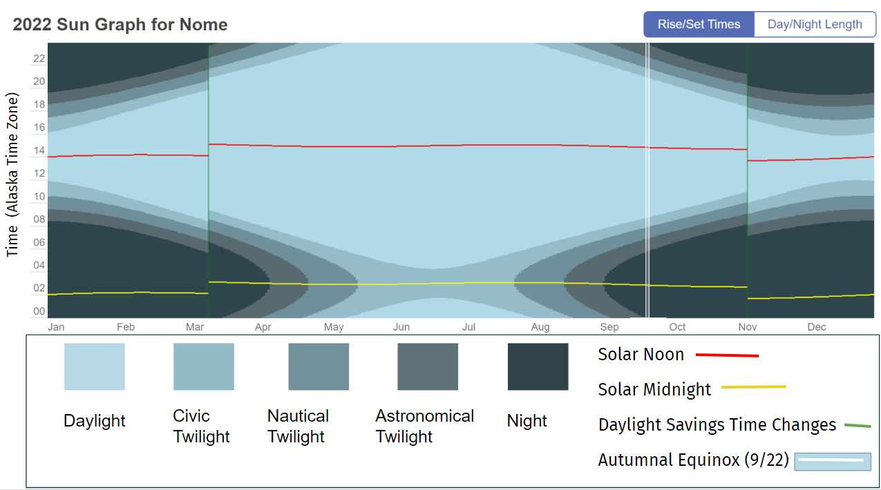
TimeandDate.com makes sun graphs of any location in the world. These graphs show the length and time of daylight, twilight and night over the course of 2022. We focus on Nome, Alaska, as a location to the north of the state and to the west within the Alaska Time Zone. How does light change over the year? How do we humans adjust our clocks to shape our connections with the natural world and with each other?

This sun graph depicts daylight, twilight, and night throughout 2022 for Nome, Alaska, using a 24 hour clock to show local times, not am and pm.  The graph shows how skewed Nome’s clock time is from its solar time.  Solar noon in Nome – when the sun is highest in the sky – happens at 14:00 (2:00 pm) in the winter and at 15:00 (3:00 pm) in the summer.  Similarly, the darkest part of the night is at 2:00 or 3:00 in the morning, not at midnight.  

The graph differentiates among the different types of twilight (specific definitions are in the slide deck). From mid-May through mid-August, the darkest that it gets in Nome is “Civic Twilight” when there is “still enough natural sunlight … that artificial light may not be required to carry out outdoor activities.” The graph also shows how switching over to Daylight Savings Time (in March) and back to Standard time (in November) shifts clock time an hour later and then earlier.  

We chose Nome as the main graph because it’s close to the western limit of the Alaska Time Zone (-9 UTC) and so its solar time is particularly skewed.  This additional slide shows how sun graphs differ within the Alaska Time Zone at 5 different locations in Alaska, and, for further comparison, Disneyland in California is included. 

In looking at these sun graphs simultaneously, we can see that in Unalaska – which is about as far west as Nome – the solar time is equally skewed, but, because it’s further south, they experience astronomical twilight there in the summer months, when it’s dark enough for most celestial objects to be viewed.  By contrast, Hyder, to the far east of ADT, experiences solar noon a little early (11:30 am) in the winter and a little late (12:30 pm).  (Of course, variation within the hour before and after solar noon is to be expected.) Utqiagvik is in the most northern part of Alaska and its sun graph reflects that – no twilight at all in the summer months and no daylight at all in the winter months.  However, Utqiagvik is not as far west as Nome, and its solar noon is less “off” (about 1:00 pm in the winter and 2:00 pm in the summer). The sun graphs of Juneau and Fairbanks reflect their respective locations.  Disneyland, far to the south and closer to the equator, experiences much less variation in the amount of daylight each day and much shorter periods of twilight (note: it’s also in a different time zone).

Time zones were initially figured out mathematically (by dividing the earth into 24 zones, one for each hour of the day, beginning in Greenwich, England, and then radiating out along longitudinal lines).  They were then significantly adjusted to accommodate political boundaries and geographic landmarks.  Since then, individual political entities (e.g., countries, states, and/or provinces) have been deciding for themselves how and where they want to adopt those time zones and during which part(s) of the year, for their particular boundaries. (Fig.2)  Each time zone is described by how it relates (+ or -) to UTC (Universal Time Coordinated).  Greenwich, England is 0 UTC.  

The contiguous US spans 4 time zones – Eastern (-5 UTC), Central (-6 UTC), Mountain (-7 UTC), and Pacific (-8 UTC).  Alaska, given that it is as wide as the contiguous US, also spans the equivalent of 4 time zones. Until as recently as 1983, all 4 time zones were used within Alaska as shown (more or less) in the diagram below  Now, all of Alaska is either in Alaska Time (-9 UTC) or Hawaii-Aleutian Time (-10 UTC).  The dividing line between time zones within Alaska is just west of Unalaska.  

Deciding how to adapt clock time across broad geographic distances has been a complicated and often heated discussion for more than a century at many levels. For many years, each community set its own clocks according to the sun. 

“In North America, a coalition of businessmen and scientists decided on time zones, and in 1883, U.S. and Canadian railroads adopted four (Eastern, Central, Mountain and Pacific) to streamline service. The shift was not universally well received. Evangelical Christians were among the strongest opponents, arguing “time came from God and railroads were not to mess with it,”…” (NYTimes)

Similarly, discussions about Standard vs Daylight Savings Time – whether to switch and, if so, which to keep  permanent – have raged for decades in the US and elsewhere.  

“To farmers, daylight saving time is a disruptive schedule foisted on them by the federal government; a popular myth even blamed them for its existence. To some parents, it’s a nuisance that can throw bedtime into chaos. To the people who run golf courses, gas stations and many retail businesses, it’s great.” (NYTimes)

Most recently, the U.S. Senate voted, in the spring of 2022, to stay on Daylight Savings Time permanently.  That bill is currently stalled in the U.S. House.  Both Alaska senators voted to make Daylight Savings Time permanent.  

In Alaska, the challenges have revolved around how the choice of time zones might unify Alaska, force distant communities to adhere to clock times that adversely affect their daily lives, and/or might further connect or disconnect Alaska from the US West Coast, where much business has centered. During WWII, “Southeast Alaska was put on Pacific Time during World War II to synchronize the state capital with San Francisco and Seattle.” In 1983, when Alaska switched from 4 time zones to 2, some communities chose to stay on Pacific Time to be aligned with the banks and businesses in Seattle (Ketchikan) and to be aligned with the Bureau of Indian Affairs in Portland (Metlakatla). They have since switched over to Alaska Time. 

Elsewhere, China, a country even wider than the state of Alaska and spanning 5 time zones, has chosen to keep the entire country on Beijing time since 1949. The Yukon Territory, in 2020, decided to stop switching from daylight to standard time.  They are now permanently at -7 UTC.  That means that in the summer, they are one hour ahead of Alaska (i.e., they are aligned with Pacific Daylight Time) and in the winter, they are two hours ahead of Alaska (i.e., they are aligned with Mountain Standard Time)

What do you think?  

  • How do daylight hours in Nome align similarly or differently from where you are?  Why?  
  • How does Daylight Savings Time (March-November) impact you, if at all?
  • Would you rather more daylight in the morning year-round (that’d be Standard Time, like now, late November) or would you prefer more daylight in the afternoon/evening year-round (that’d be Daylight Savings Time, like in summer and early fall)?
  • If you were to choose either Daylight Savings Time or Standard Time to make permanent for the entire country, which would you choose and why?  Who might have a different preference and why?
  • If you were in charge of Time Zones for Alaska, how many would you choose?  Which ones?    
  • Or, should we have Time Zones at all?  Are there alternatives?

There’s lots of fascinating history behind the creation of and disagreements around Time Zones and Daylight Savings Time at world, national and state levels.  We’ve included several very readable articles in resources; check them out.

Finally, one more note that may clear up some questions: 

The Prime Meridian (0°longitude) and the Ante Meridian (180°longitude) “divide” the earth into the western and eastern hemispheres.  Most of Alaska is east of the 180th meridian, but parts (e.g., Attu) are west of the 180th meridian; that means that Alaska is the state that is, technically (mathematically), both farthest west and farthest east! The International Date Line runs roughly along the 180th meridian, but because it’s a political construct, people have adjusted it to run west of (rather than through) Alaska and so all of Alaska (and the US) remain in the same date. 

Additional Resources:

Visualization Type: Area Graph

Data Source: Time and Date

Visualization Source: Time and Date

It can easily be replicated. Go to the Time and Date and select the place that you want the sun graph of.

Exercise Heatmap

Notice, Wonder, Connect Juneau
Notice, Wonder, Connect Fairbanks

Strava, one of the most popular exercise apps, has a heatmap of all exercise done over the past year. It shows where people are recording workouts and the paths they are taking. You can also filter by activity type to see the differences between biking, running, winter, and water activities.

Physical activity is happening every day all around you. From biking to school or work to walking downtown to skiing at the slopes to swimming on a lake, we are moving around for fun, exercise, and jobs. All of this activity is not evenly distributed though. Many people use the Strava app to record their exercise so that they can compare their activity over time. Strava users have the option to make their data visible to anyone or just to select friend groups. Strava uses the public data to create these heatmaps so everyone can find trends.

Who do you think might use these heat maps and why?

Strava puts each activity into one of four activity types. When users click on their recording devices, they mark what type of activity they’ve done. Strava uses complicated algorithms to screen/filter out data that they think doesn’t fit. For example they remove data that appears too fast for a specific activity. What are the advantages and disadvantages of this filtering?

  • Ride: Ride, Handcycle, Wheelchair, Velomobile, E-Bike Ride, Mountain Bike Ride, Gravel Bike Ride, E-Mountain Bike Ride, Skateboard
  • Run: Run, Walk, Hike, Rock Climbing, Trail Run
  • Water: Swim, Kitesurf, Windsurf, Kayaking, Rowing, Stand Up Paddling, Surfing, Canoeing, Sailing
  • Winter: Alpine Ski, Ice Skate, Backcountry Ski, Nordic Ski, Snowboard, Snowshoe, Winter Sport

Look at the map and see how usage varies by these activity types. What trends can you find? Can you identify any local landmarks by comparing the popularity of different activity types? In some cases, this will depend on your climate.

If we look at Juneau, we can clearly see a spike of winter activity at Eaglecrest Ski Area.

Figure 2. Strava Juneau Winter Activities Heatmap

However, Fairbanks with its colder climate has a much more dispersed winter activities.

Figure 3. Strava Fairbanks Winter Activities Heatmap

If we look at water activities, we can find similar patterns

Figure 4. Strava Juneau Water Activities Heatmap
Figure 5. Strava Fairbanks Water Activities Heatmap

Both Juneau and Fairbanks see a spike of water activities around docks and other launch sites. In Juneau this corresponds to North Douglas Launch Ramp, Auke Lake, and most noticeably Mendenhall Lake (a popular tourist destination). For Fairbanks, Chena River Lakes Recreation Area launch sites (in the east side), Tanana Lakes Recreation Area launch sites (in the south central side), and launch sites along the Chena River are major spots.

The Strava Heatmap is composed of public data collected from Strava users’ recorded workouts from the past year. Currently over 100 million people use Strava. Are these people an accurate representation of the average person? What groups do you think are over or under-represented? What about these workouts? Do you think everyone records all the activities they do? What types are more likely to be recorded and made public? This might be useful data for trail planners trying to determine which routes to focus on. Meanwhile, city planners might find the data overrepresenting certain ethnicities and therefore not accurate enough for determining where to put bike lanes. Only using data from the past year presents another conundrum. On one hand, old roads or former trails will disappear from view more quickly, allowing them to recover from overuse. Routes that change seasonally are also impacted. Do you know of any trails in your community that might disappear on the heatmap because of this?

For a point to appear on the graph, multiple people have to have walked along it. The brightness is then determined by how many people used that path compared to other nearby routes. The colors are then distorted to make them more evenly distributed. This magnifies small differences. What this means is that what is really bright in one location is not equivalent in popularity to really bright in a different area. It also means that something twice as bright is not necessarily twice as popular. Strava chose this methodology to provide a more visually appealing image. What do you think about this choice? While the picture may look nicer, someone who has not read the details might think a trail is more popular than it is.

What are some of the consequences of having all of this data available? Some people use this to find new trails close to their home or when they visit someplace new. The danger is that they might not have properly researched a route and go in unprepared, especially if that route is seasonally dependent. For example, some years Mendenhall Lake in Juneau freezes over and can be walked across safely. Someone unfamiliar with the lake might assume it is always safe to cross and end up falling into it and getting hypothermia. It can also lead to more people following a path they see on Strava that is not an official trail. Over time this can greatly degrade the route and cause harm to the environment.

Online publicly available user data can often cause unintentional harm. For example, several years ago, Strava heat maps were used to identify foreign military bases and common patrol routes. Furthermore, even though Strava anonymized their data, individuals were able to connect it with other Strava and outside data sources to figure out who the people running these routes were, where they lived, and what other locations they frequented. Obviously this poses a huge security and privacy risk for both the military and the individuals. How do we balance freedom of information with the safety concerns of this information? Published speed records like what Strava has for their routes can encourage risky behavior. On particularly dangerous routes, runners are incentivized to perform risky moves in order to save on time. Not only does this risk their health, but it also can force emergency services to go into dangerous conditions to rescue them.

Additional Resources:

Visualization Type: Heatmap

Data Source: Strava Data (proprietary)

Visualization Source: Strava Global Heatmap

It can easily be replicated. Go to the Strava Heatmap, select the activity type you want to see, and zoom into the area you want to see.

Subsistence Harvesting

Slow Reveal
Notice, Wonder, Connect

(So many great) Student Suggestions for Catchy Headlines: “The Pie Food,” “Alaska’s Meat Pie Charts,” “Animals That Die the Most,” “Wild Foods We Use,” “The Harvesting of Two Places,” “The Harvests of Alaska,” “Surf and Turf in Alaska,” and “Alaska’s Different Diets.”

These graphs show the subsistence harvest of two villages in Alaska based on household samples conducted by the Alaska Department of Fish and Game, Subsistence Division. Harvest is converted to pounds for consistency in comparison.

Subsistence harvesting is a crucial way of life for many Alaskan Natives. Alaska state law and federal law define subsistence uses as the “customary and traditional” uses of wild resources for various uses including food, shelter, fuel, clothing, tools, transportation, handicrafts, sharing, barter, and customary trade. To determine if a resource is associated with subsistence, there are eight criteria Alaska Department of Fish and Game look at. They are: length and consistency of use; seasonality; methods and means of harvest; geographic areas; means of handling, preparing, preserving, and storing; intergenerational transmission of knowledge, skills, values, and lore; distribution and exchange; diversity of resources in an area; economic, cultural, social, and nutritional elements.

Angoon and Kobuk both display a large amount of subsistence harvesting. Angoon displays a much broader diversity of food then Kobuk. Kobuk, however, has a much larger amount of harvesting per person. Interestingly, both communities do the majority of their harvesting of fish (many different types), but their largest single resources are land mammals (deer in Angoon and caribou in Kobuk). There is virtually no overlap in what resources they are collecting though. This is due to the vastly different climate Angoon has in the Southeast compared to Kobuk in the Interior.

There were lots of questions from students about the range of animals, especially caribou and deer, so we’re adding some maps below and a website for you to research more animals.

All of these graphs are from the Alaska Department of Fish and Game. Go to https://www.adfg.alaska.gov/index.cfm?adfg=animals.listall to find the ranges for all animals in Alaska.

Another student noticed that there was more chum salmon harvested in Kobuk than in Angoon. We asked Flynn Casey, who works at ADFG, for more insight on that and he said:

“To start with a simple answer, chum salmon do appear in the Angoon harvest data…. The number for chum is 1.3 pounds per capita. …[A]ny resource that clocks in under 2 pounds per capita gets binned into the ‘other’ category….

It’s also important to remember that the data represents this snapshot in time which could be an outlier in some way(s). For example, 2012 seems to be a year of relatively weak salmon returns compared to prior years during which subsistence harvest data was collected, both for Angoon and Kobuk…. 

While there are probably several factors relating to that big difference in chum harvest, a little scanning of the relevant tech papers (399 for Angoon; 402 for Kobuk) suggests that it is largely driven by how much each community targets chum salmon compared to other salmon species. Chum are the only species of salmon to be found in significant quantity near Kobuk (notice no other salmon species shows up in the Kobuk pie chart), so it’s a highly targeted fish. For Angoon, much of the 2012 subsistence fishing effort targeted coho and Chinook salmon, either by trolling or rod-and-reel, in coastal waters. The remaining salmon species can be caught among the same few systems of inside protected waters, but most of the effort there was for sockeye salmon.

*Another interesting factoid from the Kobuk paper: while similar weights of caribou and chum salmon were harvested in 2012… “Many respondents reported that they were not able to adequately dry much of the salmon they harvested because of incessant rain. As a result, households fed spoiled salmon to dogs in order to avoid wasting the resource.””

Finally, several students said they were surprised that there was so much caribou harvested in Kobuk and so little moose, especially because that’s so different from hunting around Fairbanks. They wondered what the graph of Fairbanks would look like. We highly recommend that you look at information below about making a graph about your own community. Email us at juneaustemcoalition@gmail.com with questions – or with your completed graphs. We’d love to add them to this post!

Additional Resources:

Visualization Type: Pie Chart

Data Source: Community Subsistence Information System, Alaska Department of Fish and Game, Subsistence

Visualization Source: Craig Fox using Microsoft Excel.

It can be replicated with medium effort and medium technical skill. First determine if the communities you want to use have data by checking the Community Observer Interactive Map of Geographic Survey Data. Only use communities with comprehensive data. For comparison purposes try to only use one village and compare over time, or compare multiple villages in the same year. Once you identify the communities and years you want to use, go to the Community Subsistence Information System. Select “Harvest by Community”, then select the community you would like to view. Select which year you want under “Project Years Available”. Check the box that says “Include Only Primary Species in Download”. Then click “Create Excel File”. Repeat this process for each community or year you want to use. Next download the file below called “Subsistence Harvesting Make Your Own”. Replace the data on the sheet called “Replace with Downloaded Data” with the data you got from the Community Subsistence Information System. Then go to the “Pivot Chart and Graph” tab. Click somewhere on the chart. On the ribbon at the top, a new option called “PivotTable Analyze” will appear. Select that and then click “Refresh”. The graph will now display the data. Change the title of the graph and update the colors. Repeat this process for each graph you want.