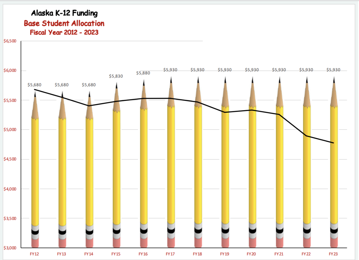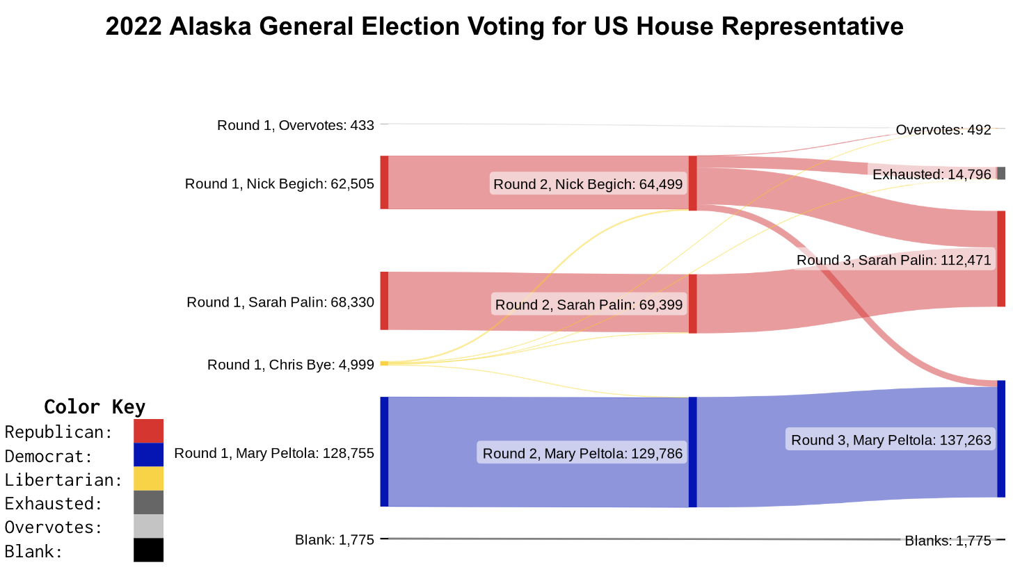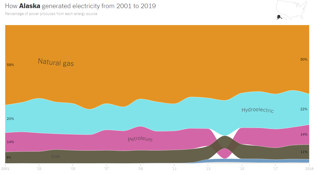
Notice, Wonder, Connect
Slow Reveal
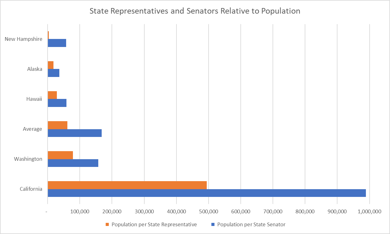
This bar graph focuses on state legislators. It shows the ratios of population to state representative and to state senator. How do the ratios in Alaska compare to those in other states or the national average? What factors might influence how these ratios vary from state to state?
As seen in this graph, the proportion of population to legislators tends to increase as the population size of the state increases (California has the largest population and the largest proportion) but this is not always the case. Alaska’s population is the third smallest (after Wyoming and Vermont), but its proportion of population to senators is the 7th smallest and its proportion of population to representatives is 10th smallest.
The United States has a federalist government. This means the powers are shared between a federal government and a state government. While we often spend time talking about the federal government, the state government plays an equal (and in many ways, greater) role in your day-to-day life. Like the federal government, most states have a legislature with two chambers (called a bicameral legislature). The one exception is Nebraska which only has state senators and no state representatives (called a unicameral legislature).
Both the federal government and state governments have to find a balance when deciding the size of their legislative bodies. A larger body means more representation and potentially more different voices heard but also could mean too many people talking, more money spent on salaries, and more elected officials to keep track of. Each state decides how it wants to handle this issue, but, generally, as the population of a state increases, so does the number of representatives it has. That rise is usually not linear. As the population increases, the number of representatives normally increases at a slower and slower rate until it stops altogether. This means more people being represented by a single legislator. We can look at the proportion of the number of people per representative to see how large an average district is within a state.
The writers of the U.S. The Constitution believed a ratio of 30,000 people per 1 representative was the proper balance for federal representation. Now, that ratio is over 25 times larger. The United States was much more rural at its founding and so 30,000 people covered a much larger geographic area than now. Also, communication technology was much less advanced, so larger areas had less frequent communication than they do now. Taking those factors into consideration, what do you think of the current ratio for federal representation? Is 30,000:1 still the proper balance for federal representation? What about for state legislatures?
What other solutions do you think would help balance representation and the size of the legislature?
Data Source: https://ballotpedia.org/Population_represented_by_state_legislators
Reproduce the graph yourself or pick different states using the spreadsheet below.
Additional Resources
- NYTimes article on representation in the United State Congress
- https://ballotpedia.org/Population_represented_by_state_legislators
- 2020 Census Apportionment Results, “Table A. Apportionment Population, Resident Population, and Overseas Population: 2020 Census and 2010 Census,” accessed October 15, 2021