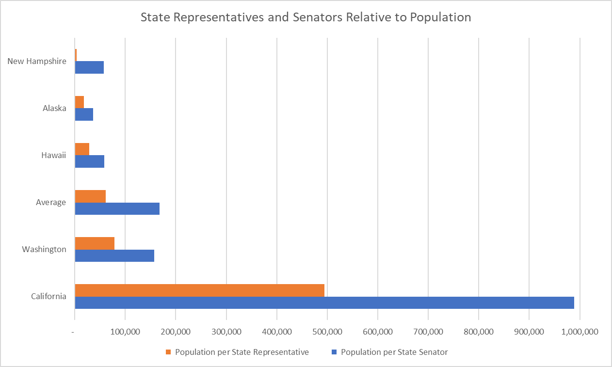
This bar graph focuses on state legislators. It shows the ratios of population to state representative and to state senator. How do the ratios in Alaska compare to those in other states or the national average? What factors might influence how these ratios vary from state to state?
As seen in this graph, the proportion of population to legislators tends to increase as the population size of the state increases (California has the largest population and the largest proportion) but this is not always the case. Alaska’s population is the third smallest (after Wyoming and Vermont), but its proportion of population to senators is the 7th smallest and its proportion of population to representatives is 10th smallest.
The United States has a federalist government. This means the powers are shared between a federal government and a state government. While we often spend time talking about the federal government, the state government plays an equal (and in many ways, greater) role in your day-to-day life. Like the federal government, most states have a legislature with two chambers (called a bicameral legislature). The one exception is Nebraska which only has state senators and no state representatives (called a unicameral legislature).
Both the federal government and state governments have to find a balance when deciding the size of their legislative bodies. A larger body means more representation and potentially more different voices heard but also could mean too many people talking, more money spent on salaries, and more elected officials to keep track of. Each state decides how it wants to handle this issue, but, generally, as the population of a state increases, so does the number of representatives it has. That rise is usually not linear. As the population increases, the number of representatives normally increases at a slower and slower rate until it stops altogether. This means more people being represented by a single legislator. We can look at the proportion of the number of people per representative to see how large an average district is within a state.
The writers of the U.S. The Constitution believed a ratio of 30,000 people per 1 representative was the proper balance for federal representation. Now, that ratio is over 25 times larger. The United States was much more rural at its founding and so 30,000 people covered a much larger geographic area than now. Also, communication technology was much less advanced, so larger areas had less frequent communication than they do now. Taking those factors into consideration, what do you think of the current ratio for federal representation? Is 30,000:1 still the proper balance for federal representation? What about for state legislatures?
What other solutions do you think would help balance representation and the size of the legislature?
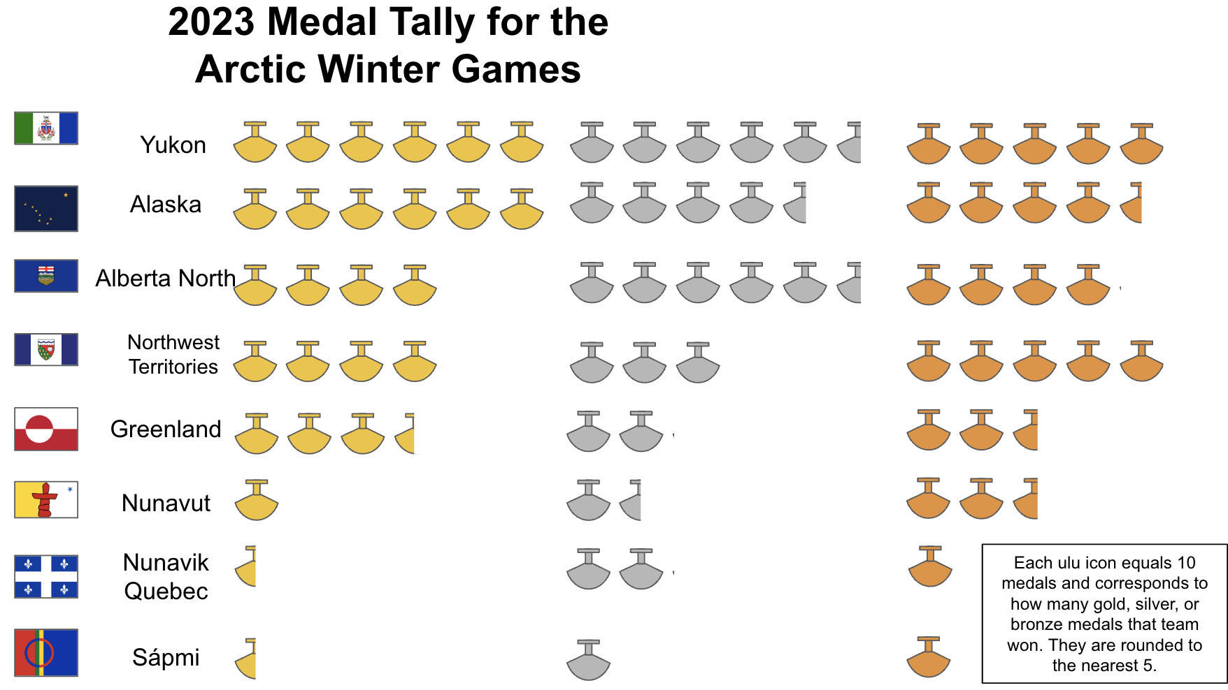
This data shows the medal tallies for the 2023 Arctic Winter Games in a pictographic format. Complete listings are here. There’s a wide range in the number of medals won by each team, from close to 25 total to close to 165 (numbers are approximate because of rounding).
There are a variety of possible reasons for why some teams win more medals:
Some teams are bigger than other teams
The population pools are larger for some teams
There are more than 730,000 people in Alaska and fewer than 14,500 in Nunavik.
Distance from home to location of the Games is closer and it’s easier for more athletes to travel
Some teams can afford to bring more athletes because of the cost of:
Transportation to the Games
Uniforms, equipment
Food and lodging during the Games
Athletes from some teams are better prepared in some sports
Training knowledge and experience is greater in some some communities than in others
On-going financial support for all or some sports varies and impacts:
What kinds of sports facilities, training, equipment are available back home, when, and for whom
The number of events in different sports varies considerably.
There are two or three events in most team sports such as Basketball, Curling or Volleyball. In contrast, there are multiple events in individual sports such as Arctic Sports (35), Wrestling (25), Dene (24) and Cross Country Skiing (24).
The contingent with the largest population, Alaska, took home the second most medals. The team with the most medals, Yukon, is the contingent with the third smallest population.
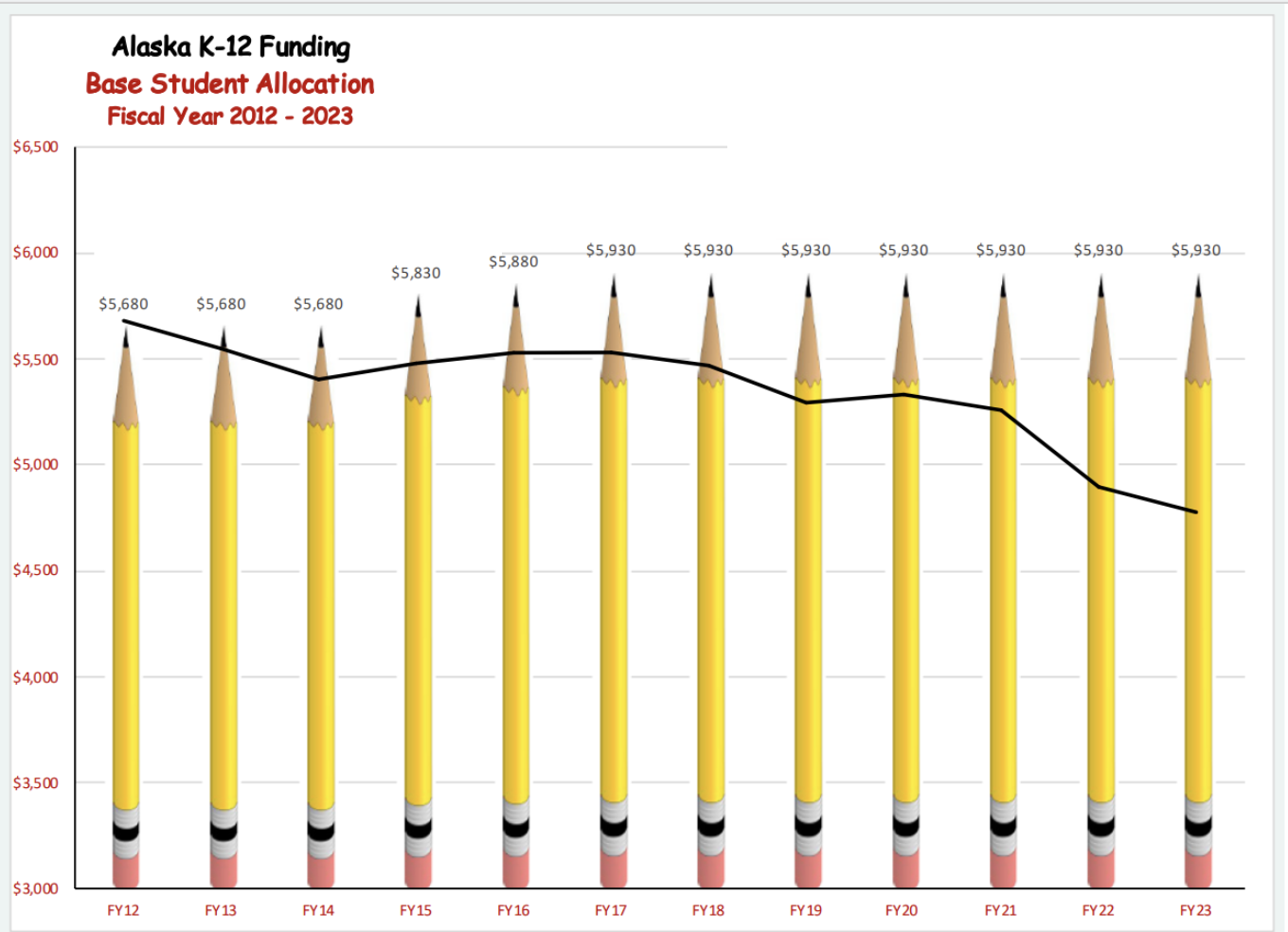
The top graph shows a comparison between Alaska’s K-12 yearly public school funding and the significantly decreased value of that funding due to inflation over the last eleven years, from 2012 to 2023. How should the State of Alaska decide how much money to distribute to the schools for education?
Background on Education Funding:
Determining the Base Student Allocation:
The yearly funding is based on the BSA (Base Student Allocation; a dollar amount per student), which is established in a law, voted upon by the Alaska State Legislature. That BSA amount is then multiplied by the AADM (Adjusted Average Daily Membership) to determine the amount for each school district; those numbers are all added together to determine Basic Need to determine the total education funding provided. The AADM is determined by the actual number of students (Average Daily Membership, or ADM) adjusted by several factors such as size of schools, cost of living in different districts, and additional costs for special education. The actual sources for the Basic Need funding is a combination of required local funding from municipal school districts, deductible federal impact aid (federal funds to, among other things, offset lands that are exempt from local property taxes), and State funds. There are also some additional state and federal funds, described below.
Other Education Funding in Alaska
Every year there is also a formula for funding transportation for each district. Slide 16 shows the match between funding allocated and actual transportation costs since 2013. In general, the allocated funds are less than the actual costs (fuel and staffing, primarily) which has meant that districts have had to use some of their BSA funds to pay for transportation.
Some years – as seen on the original graph (slide 8) there is additional one-time funding provided by the state that it is outside of and in addition to the BSA formula funding. That funding when reported as a lump sum sounds large, but when divided out per student (as in slide 11) shows up as a useful but not very significant increase for each school district.
There are additional funds coming into school districts directly via Title I (federal) funding, local municipal funding, and district or school generated grants and fundraising.
Inflation and the BSA
The BSA has not been increased since 2016 (i.e., FY2017), so education funding has not kept up with inflation. The question being hotly debated now in the legislature is how much to increase the BSA for Fiscal Year 2023-24 (known as FY24; synonymous with school year 2023-24). Districts across the state are reporting struggles as their costs – such as fuel, classroom materials, and insurance, – rise, but their funds remain constant. Some districts have closed schools and “many have cut staffing and services, increasing the number of students in each classroom.” (Alaska Beacon) In rural schools, funding deficits have a particularly large impact; schools cannot pay for needed repairs and, for instance, have to manage without water or close!
A wide range of remedies – and corresponding legislative bills – are currently being suggested. They vary widely in their approaches, including how much to increase the BSA, how to pay for it, how to plan for future inflation, and whether or how to include “accountability.” Last year, a $30 increase to the BSA was voted in to begin in FY 24. Additional suggestions and/or bills for FY24 range from $0 (from the governor) to $860 to $1000 to $1250. Refer to the resources list for more details.
The creator of the “pencil graph” is the Alaska Council of School Administrators (ACSA), using data from Alaska Legislative Finance. ACSA represents school administrators and is working, among other efforts, to convince legislators to increase the BSA. ACSA made choices, in creating its graph, to emphasize the declining value of the BSA due to inflation over time, i.e., to make the inflation line look steep and dramatic. By contrast, the graph above, created by the Alaska Legislative Finance itself, made choices that show the decline, but do not make it seem as severe.
Pencil Graph by ACSA (slide 4)
Graph by AK Leg Finance (slide 10)
Scale
Every line = $500
Every space = $1000
Y axis start point
$3000
$0
X axis start point
FY12
FY14
X axis end point
FY23
FY24 (proposed by Governor)
Inflation reference year
FY12
FY22
Difference in BSA value (adjusted for inflation)
$1154 in FY12 dollars
$1043 in FY22 dollars
Making Comparisons about Education Costs
Comparing the cost of education within Alaska and between Alaska and other states is not simple and is, sometimes, political. Alaska generally ranks among the top ten in total dollars spent per student (around $17,000), however when the cost of living is factored in, Alaska ranks much lower. The Institute of Social and Economic Research at the University of Alaska Anchorage determines cost of living differentials among Alaska school districts; they also compare Alaska to the rest of the US. For that report, see here. Specifically, costs that are much higher in Alaska than other states and also much higher in Alaskan villages than in hubs are: health care for staff, energy, and the preponderance of small schools (which can’t benefit from efficiencies of scale and have more frequent and costly staff turnover. In addition, small schools in villages are disproportionately affected by climate change and climate or other hazard events.) ISER concluded that “… that by 2019, even though Alaska pays more than any other state on a per-student basis, the cost of living here is so high that once that factor is included, public schools here received less money than the national average.” (Alaska Beacon)
Written by Brenda Taylor, with frequent references to publications from Alaska Council of School Superintendents, Alaska Legislative Finance, and the Alaska Beacon.
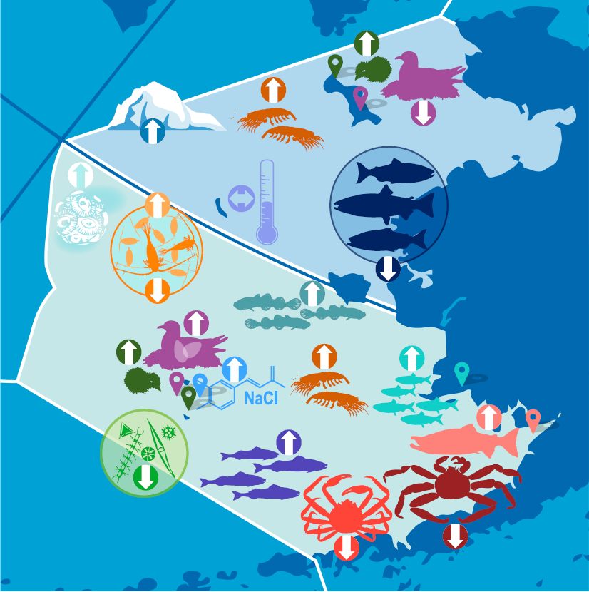
Headlines suggested by students: “Ecosystem Changes in Alaska,” “The Arrows of Climate Change,” “The Ups and Downs of Alaska’s Animals,” “The Alaskan Marine Life Population Change,” and “The Population of Alaska’s Animals.”
This graphic shows how different aspects of the ecosystem in the Eastern Bering Sea – from temperature to salinity to birds to fish – fared in 2022, relative to ongoing trends (not fashion trends!) Environmental conditions, like ocean temperature, affect plants and animals in different ways. The Bering Sea has been warming and this graphic shows how the impact of such climate change can result in “winners” and “losers”. In addition to a long-term warming trend, the Bering Sea recently experienced a “pulse event” of a near complete lack of sea ice during the winters of 2017/18 and 2018/19. In 2022, there were some clear ecosystem responses to these environmental changes, such as increases in pollock and herring and decreases in several crab stocks and multiple salmon runs in Western Alaska. This graphic (and accompanying report) is created annually by NOAA Fisheries (part of the Department of Commerce) in order to provide a contextual summary of what’s happening in the ecosystem so fisheries managers can then make decisions about how many fish or crab can sustainably be harvested.
The graphic was designed to encourage “big picture” understanding – quite literally. There are no numbers, only directional arrows, and no words, only icons. (There is, of course, corresponding text in the report that describes the arrows and icons in ever increasing detail.) What are the advantages and disadvantages of excluding numbers and words?
NOAA Fisheries creates graphics in this style for each of its Large Marine Ecosystems (e.g., Eastern Bering Sea, Aleutian Islands, Gulf of Alaska) and has been doing so since 2018. They have produced longer text reports since the 1990s. (The graphic and summary report are not prepared for the Arctic Region because there are no commercial fisheries there.) This graphic is from the “2022 Eastern Bering Sea Ecosystem Status Report: In Brief” produced by Elizabeth Siddon (based in Juneau) with the Alaska Fisheries Science Center, NOAA Fisheries. The complete In Brief is available here. The concept of these graphics was developed by Elizabeth Siddon and the other two leads for the Ecosystem Reports, all of whom worked very closely with the NOAA Communications Program. Since then, the report style has been imitated by other NOAA centers in other parts of the country. The reception of the 4-page In Brief(s) has always been very positive, in part because, prior to the Briefs, the only option was to read a 200+ page report. These In Brief documents are the only ones printed in color for distribution by NOAA, e.g., at fisheries management meetings, or for mailing to rural communities where bandwidth might prevent people from being able to download the reports.
NOAA’s goal in these graphics is to provide an accurate, but general summary of how things are changing in the ecosystem, and not to overwhelm readers with too much information. If people are interested in more details, they can read the full Ecosystem Status Report (here). Creating one graphic that summarizes 200 pages of dense data is a complex, collaborative and nuanced process. Among the many considerations that the authors make concerning the data are:
Deciding which pieces of data from the full Report get an icon and make it into this graphic is complex. There is no set formula for that process.
Similar icons are used across the management areas (i.e., you’ll see thermometer icons in all regions, but the trend arrow is based on data collected within each region).
All arrows are the same size. This is because each icon and arrow is based on a unique dataset; the report authors don’t compare across datasets (that would be like comparing apples to oranges) to be able to indicate whether one increase is larger than another. In general, arrows refer to long-term trends, not short-term, temporary changes.
Determining trends is difficult and not necessarily consistent from one graph to another. Similarly, quantifying “typical” is essential, and yet not clearcut. Sometimes a line of regression is used. Sometimes it’s a +/- 1 Standard Deviation. Differentiating year-to-year variability from longer-term trends is also important. (See the examples below about surface air temperature and salinity.)
Up arrows indicate an increase. Sometimes that increase is a good thing for the ecosystem as a whole; sometimes it is not.
Some icons are specific to a place and are represented with a pin (e.g., auklets) and other icons represent data collected across a wide area. Every attempt is made to place icons as close to the geographical place of significance, but, occasionally, certain icons are placed in less relevant spots simply because there was space available on the graphic.
This graphic is based on the most recent data available, which generally means data from 2022, but in some cases means data from 2021. Real-time (2022) information is much preferred by the fisheries managers. When the author started the Eastern Bering Sea Report in 2016, about 50% of contributions were based on the previous year’s data and about 50% were based on current year data. Since then, more and more contributors are working as hard as they can to turn data around FAST after summer field surveys in order to provide it to the reports. As a result, in 2022, ~95% of the Bering Sea report was 2022 data!
Fish are labeled by the year they were born. So, for instance, the 2017 year class of pollock were age-0 in 2017 and were age-5 in 2022.
The circled icons are multi-species groupings (e.g., the chlorophyll circle is a measure of phytoplankton, of which there are a bunch of different species). The copepod circle includes multiple species of copepods grouped together. The salmon circle includes Chinook, chum, and coho salmon.
Slide 3 asks the question of HOW you develop a synthetic “story” from disparate data pieces. How do you connect the dots between sea ice and sea birds? And what do sea birds tell us about the health of the ecosystem for the fish and crab stocks that NOAA manages? Each year, the report editors strive to take dozens of individual data and create a “story” about what is happening in the ecosystem that people can understand. But the final “story” each year doesn’t necessarily include ALL the data pieces. Some pieces don’t “fit” the story; how do the editors determine that “fit”?
This graph depicts the year-to-year variability (spikes) of Surface Air Temperature (SAT) Anomalies at St. Paul Island (Pribilof Islands) overlaid on the long-term trend (increasing line). From it, one can see that, while in the short-term, 2022 cooled and the yearly average of temperatures was “normal”, over the last 40 years, there has been a steady increase of temperature of 0.5C/decade.
TERMS frequently used:
Bering Sea Shelf – the Continental shelf extends under the eastern half of the Bering Sea. (The lighter blue in slide 3).
Shelf break – where the Continental Shelf ends and the deep sea begins. The depth increases quickly from 200m to >1000m.
Anomaly/anomalies – the deviation or difference from past “normal”. In a graph, typically, “normal” is 0 and anomalies are above or below.
Trend – the general direction over time
ICONS and ARROWS
The author chose icons for the WGOITAG slides that were representative of different aspects of the physical environment and food chain as well as those that represented some of the different data considerations noted above. Icons are listed in order from the physical environment (temperature, sea ice, salinity), to primary production (chlorophyll, coccolithophores), to secondary production (zooplankton), forage fish (herring), groundfish (pollock), salmon, crabs, and seabirds.
Physical Environment
Temperature Content: The extended warm phase (2014-2021) is largely over. Temperatures have returned to pre-warm phase averages. Data Consideration(s): The “warm phase” is clear to see in the accompanying graphs. It’s not so clear how to define the beginning and end of that warm phase, though. The horizontal dashed lines are +/- 1 Standard Deviation. Specifically, is 2014 warm enough to be considered warm? 2014 is within 1 SD of average in the Northern Bering Sea, but above 1 SD in the Southeastern Bering Sea. The author of this report, with a great deal of collaboration with other experts and oceanographers, decided yes; someone else might have decided no.
The y-axis here is surprising – 500?! The y-axis is the cumulative annual SST (sum of daily temperatures) anomalies – so “0” is the long-term average. In the graph, the scientists chose to show the cumulative SST because cumulative warming may represent important conditions for the ecology of the systems as total thermal exposure for organisms was higher than historical conditions. For example, for a juvenile fish, it’s not just that it was warm for 1 day (maybe they could deal with that), but that it was warm day after day after day (cumulative) which is more stressful and harder to tolerate.
Sea Ice Content: Sea ice is by far one of the most important drivers of the ecosystem in the Bering Sea (and unique to the Bering; there is no sea ice in the Aleutians or Gulf of Alaska). Sea-ice extent remained above-average for most of winter 2021-22. However, the ice was thinner almost everywhere than the previous winter and, as a result, melted more quickly in the spring of 2022. Data Consideration(s): Because of the complexity of the content, the full Report has a variety of different data graphs to understand how sea ice is changing over time. This is an example of where the icon arrow cannot reflect both +/- simultaneously and the scientists have to make decisions. Here, the up arrow reflects the increase in areal extent of sea ice, but does not capture the reduction in ice thickness. Researchers in the Bering Sea have a better understanding of the impact of ice extent and what it means for the ecosystem. For that reason, the author chose to go with the “up” arrow. Ice thickness is a newer metric of sea ice and there is less known about what changes in thickness “mean” to the system.
Salinity Content: Salinity has been increasing steadily since 2014 (perhaps as the result of loss of sea ice), which corresponds with the warm phase from 2014-2021. In 2022, though, the salinity decreased. Data Considerations(s): The purpose of this report is to report on trends. For that reason, while there were a few data points in 2022 that showed decreased salinity, the authors of the report chose an up arrow because the longer-term increasing trend was thought to have more of an impact on the overall ecosystem. They noted the one year of lower temperatures in the text.
Primary Production
Chlorophyll-a Content: Chlorophyll-a has been decreasing since 2014. This may have serious consequences for the rest of the ecosystem because it’s the base of the food chain. Data Consideration(s): This data is from satellites. There are several advantages of satellite data, including high spatial and temporal coverage. However, these products are also limited to measurements within the surface layer of the ocean and also have missing data due to ice and cloud cover. Chlorophyll-a biomass does not directly provide information of primary productivity. Biomass is a balance between production and losses, therefore lower biomass levels could mean less production, or they could mean more of the production was eaten by grazers or sunk deeper in the water column than the satellite can “see”.
Coccolithophores Content: The coccolithophore bloom was among the highest ever observed. However, because the bloom turns the water a milky aquamarine color, it can make it more difficult for some species to see and, therefore, successfully forage for food. Data Consideration(s): Here is an example of when “up” is not thought to be a “good” thing. Coccolithophores may be a less desirable food source for microzooplankton and they cause a milky aquamarine color in the water during a coccolithophore bloom that can reduce foraging success for visual predators, such as surface-feeding seabirds and fish.
Secondary Production
Euphausiids Content:Euphausiids increased in number in both the northern and southern areas. Data Consideration(s): This is a situation where sampling bias needs to be accounted for. These data are from a sampling net called a bongo net. It’s fairly well known that larger euphausiids can actually swim and escape the bongo net, so these data are generally used to look at relative trends, but not absolute abundance values. That said, this year there was a separate euphausiid index that was derived from acoustics, and that also showed an increase. And, there was evidence that plankton-eating seabirds did well this year, so all of those factors suggest euphausiids were abundant. (Also, look at speaker notes for euphausiids slide to learn how NOAA is juggling using real time data with data that takes 2-3 years to process.)
Forage Fish
Togiak herring Content:In 2021, the herring in the specific area of Togiak (which was the 2017 year class) was significantly greater in number than previous years. Data Consideration(s): This is a place-based example specific to herring that spawn near Togiak.
Groundfish
Pollock Content: Age-4 pollock in 2022 (the 2018 year class) was well above average. Various warm and cool temperatures at crucial times in their early life cycle, as well as abundant euphausiids in 2018 and reduced predation in 2019-21, coalesced to increase their survival rate. Data Consideration(s): Pollock is the biggest commercial fishery in the US (by weight), so there is a lot of research and work on pollock. Both fisheries managers and the fishing industry are interested in recruitment (how many young fish will survive to the age/size that can be caught in the fishery). The Temperature Change Index used in the icon slide is an example of one of the considerations involved in that estimation. Juvenile abundance does not always align with adult abundance a few years later. Juvenile fish go through lots of ‘bottlenecks’, so it can be difficult to predict future adults based only on the number of juveniles. The In Brief text explains some of those potential bottlenecks.
Adult Sockeye Salmon Content: Sockeye salmon runs continued to increase – in record numbers – in Bristol Bay. Data considerations: This data is from a well-established sampling program. What is fascinating is that these sockeye are doing SO well while so many other salmon runs are doing poorly; why is that? (i.e., we know it’s not a problem with the data!).
Crabs
Snow Crab and Bristol Red King Crab Content: Because of the unprecedented warm phase of 2014-2021, and the accompanying near-absence of sea ice, crab stocks have shifted northwestward and decreased. Data Consideration(s): These icons are not place-based (if anything they might be placed further north to show their northward migration.) This is an example of placing the icons more generally…and frankly, where there was space after placing all icons that needed to be linked with a specific place.
Seabirds
Auklets (St. Lawrence Island)
Content: Zooplankton-eating seabirds, like auklets, increased both further south in the Pribilof Islands and further north on St. Lawrence Island. Data considerations: The auklets are place-based (with their own place marker) because the censuses are from discrete breeding colonies on these islands, BUT the birds are foraging over much larger areas and the researchers use them as indicators of prey available for the juvenile fish. How would you show this data? Place-based (because that’s what the data are) or general (because that’s how their data is used)?
Kittiwakes (St. Lawrence Island) Content: Kittiwakes and other fish-eating seabirds did well at the Pribilof Islands to the south, but there were more reproductive failures on St. Lawrence Island, in the northern part of the Bering Sea. That pattern is consistent with the greater availability of forage fish in the south, and lesser in the north. Data considerations:The graph used as supporting evidence is itself distinctive – a separate example of using icons (this time with varying degrees of smiley faces in eggs, instead of arrows).
Additional Resources:
Full Eastern Bering Sea Ecosystem Report Citation: Siddon, E. 2022. Ecosystem Status Report 2022: Eastern Bering Sea, Stock Assessment and Fishery Evaluation Report, North Pacific Fishery Management Council, 1007 West 3rd Ave., Suite 400, Anchorage, Alaska 99501 Contact: elizabeth.siddon@noaa.gov Links to other full Alaska Ecosystem Reports are available here. Links to all (across the US) Ecosystem Status Reports are available here. A real-time marine heatwave tracker for the Bering Sea, Aleutian Islands, and Gulf of Alaska available here.
Text by Elizabeth Siddon, NOAA (elizabeth.siddon@noaa.gov) and Brenda Taylor, Juneau STEM Coalition.
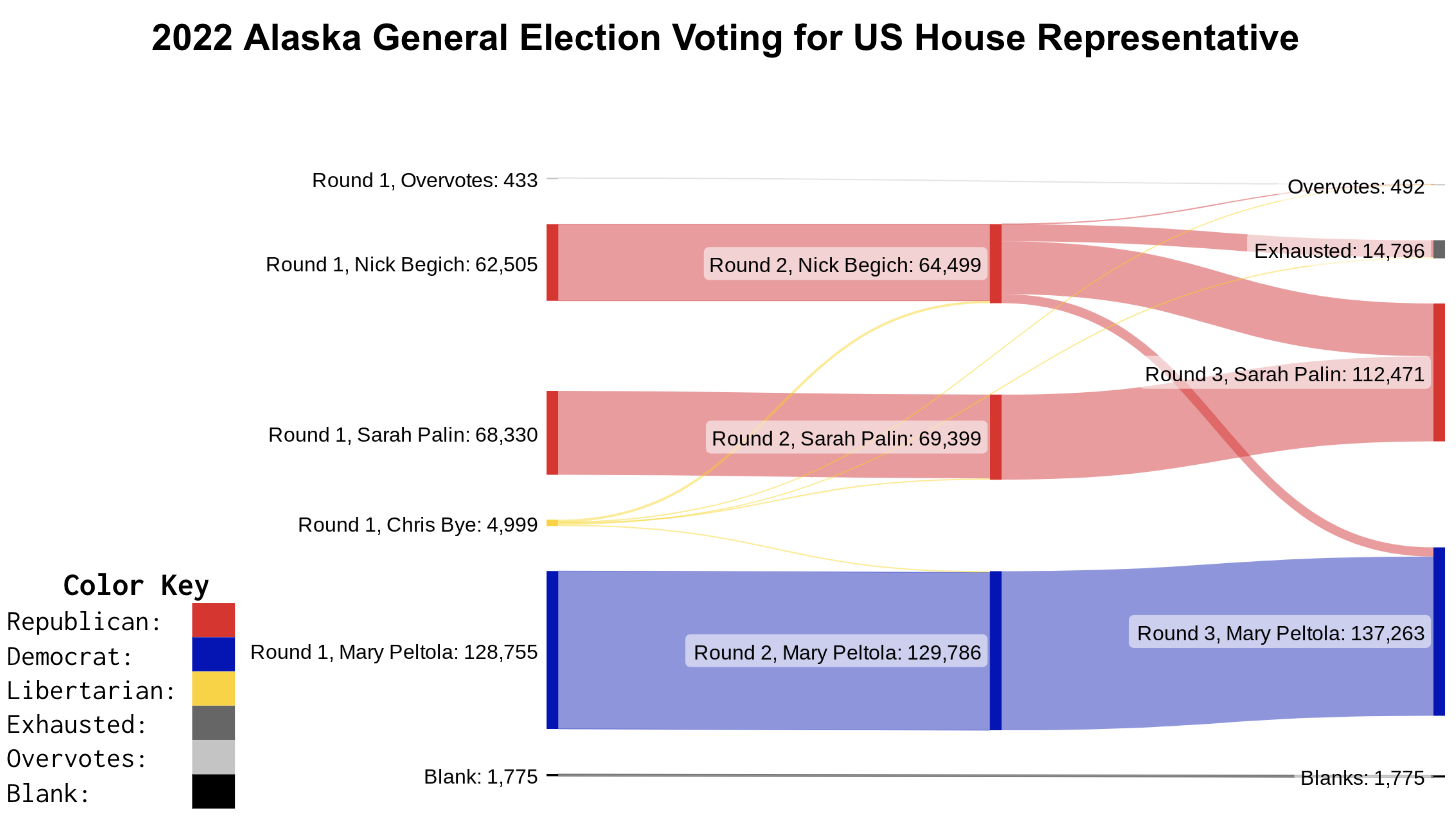
This graphic shows how the ranked choice voting tabulation process worked in the November 2022 Alaska race for US House of Representatives. In the House election, Mary Peltola (Democrat) started off with the most votes, but she had fewer votes than the two Republicans (Nick Begich and Sarah Palin) put together. However, enough of Nick Begich’s voters wanted Mary Peltola over Sarah Palin, that when he was eliminated, Peltola won. Meanwhile, the Senate saw a different situation. Lisa Murkowski and Kelly Tshibaka are both Republicans and far and away had more votes than the Democrat (or the third Republican). Neither had over 50% though. After two rounds of elimination, Lisa Murkowski won. In both of these races, the candidate who had the most votes in the first round ended up winning. The difference is that in the House race, the Republican candidates combined had more votes, but enough wanted the Democrat over the other Republican, that it changed the outcome. Meanwhile in the Senate, the Democrat had many fewer votes but when she was eliminated her votes decided which of the Republican candidates would win. In both these scenarios, ranked choice voting provided more opportunity for voters to express their preference for candidates.
Beginning in the summer of 2022, Alaska switched to a ranked choice voting system. In ranked choice voting, voters rank candidates. There are multiple types of ranked choice voting, but Alaska uses instant-runoff voting. In round one of the counting, each candidate starts with however many voters ranked them #1. If no candidate has received more than 50% of the vote, then the candidate with the fewest votes is eliminated and all their votes are distributed to each voter’s second pick. This process is repeated until one candidate has over 50% of the vote. In some cases, there is no elimination process because one candidate wins in the first round. In November, 2022, for instance, Dunleavy received over 50% of the round one votes in the Alaska governor’s race so he immediately won. However, the statewide races for U.S. Senate and House both required two rounds of elimination to reach a candidate.
There are many decisions made when designing a voting system. For example, Alaska starts with a primary. In that primary, voters only select one candidate. The top four candidates advance to the general election where instant-runoff voting occurs. All of these decisions impact the outcome of the election. Instant-runoff voting encourages a candidate to have broad appeal even if their supporters are not very enthusiastic about them. A candidate needs to get at least 50% of people to have voted for them, but they could have been a voter’s second or third choice. Meanwhile in a first-past-the-post system like most of the United States uses, a candidate needs to have the most supporters who feel strongly enough about them to pick them over everyone else even if that is still a minority of the voters in the area. Alaska tries to balance these tradeoffs by having the four general election candidates be picked by first-past-the-post and the winner be selected by ranked choice.
This graphic can be replicated with different data with some effort and minimal technical skill. Election data must be retrieved from Alaska’s Division of Elections and manually entered into SankeyMatic. The text entered to create these visualizations can be found below
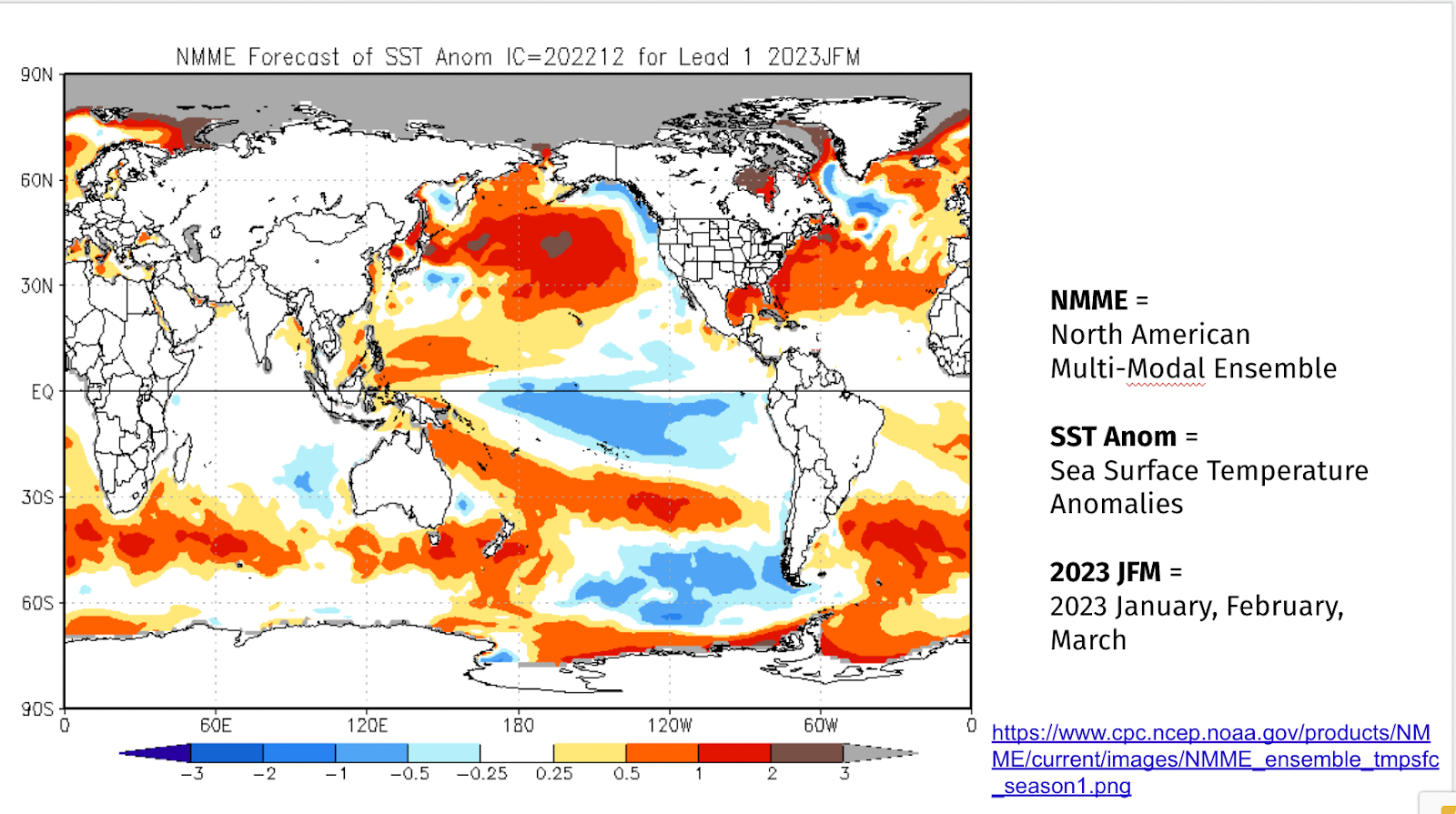
“La Nina Triple Dip” Seasonal Forecasts in Alaska, Winter 2022-23
Predicted SST anomalies (˚C) for January-March 2023 from the National Multi-Model Ensemble (NMME) of coupled atmosphere-ocean climate models.
These two graphs show some of how and what NOAA predicts for 2022-2023 winter seasonal outlooks (climate) for precipitation and temperature. The first graph (of projected sea surface temperatures) are a major factor in generating the predictions for the second graph (of predicted temperatures on land.) Overall, the second graphs shows that it is more likely that it’ll be warmer than normal in Northern Alaska and the Aleutian chain and that it’s more likely that it’ll be colder than normal in South Central and Southeastern Alaska. Note, this does not mean this is what will happen for sure; these are predictions of likelihood. Remember that: “Climate is what you predict, weather is what actually happens.” (National Centers for Environmental Information)
Nicholas Bond, a NOAA scientist, explains the creation of the first graph through the National Multi-Model Ensemble (NMME). He writes, “an ensemble approach incorporating different models is particularly appropriate for seasonal and longer-term simulations; the NMME represents the average of eight climate models. The uncertainties and errors in the predictions from any single climate model can be substantial. More detail on the NMME, and projections of other variables, are available at the following website: http://www.cpc.ncep.noaa.gov/products/NMME/.”
According to National Weather Service climate researcher Brian Brettschneider, there are three main factors that scientists use in making long-term seasonal forecasts for Alaska:
1) whether it’s a La Nina or El Nino, (or neutral) year
2) the evolution of sea ice in the Chukchi and Bering Seas, and
3) long-term trends
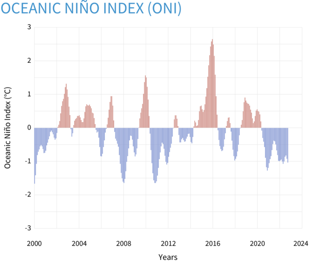
La Nina
As the climate.gov staff explain, “El Niño and La Niña are opposite phases of a natural climate pattern across the tropical Pacific Ocean.” El Nino is the warm phase, La Nina is the cool phase and there is a neutral phase as well in between the two when the temperatures and winds are closer to (long-term) averages. Generally, each phase lasts about a year, though it’s not uncommon for La Nina to last 2 years (and, once, 33 months.) During La Nina, in the tropical Pacific, surface winds are stronger and temperatures are cooler than average. La Nina (and El Nino) years are often factors in more extreme weather conditions in the rest of the Pacific area.
It’s this pattern (yes, in the tropics!) that has the greatest impact on what kind of winter we’ll have here in Alaska. What causes this climate pattern swing is not yet well understood, but the impacts of the swing around the earth are significant and are closely monitored and analyzed. This year, unusually, we are in a third year of a row of La Nina, (For more information, look here.)
Brettschneider describes the most likely effect of La Nina in Alaska: “More times than not, La Niña winters are colder than average in Alaska. Not every time, but a majority of times. So that represents about 40% of the variability [in seasonal predictions].” (APR)
Seasonal (3-month) sea surface temperatures in the central tropical Pacific Ocean compared to the 1981-2010 average. Warming or cooling of at least 0.5˚Celsius above or below average near the International Dateline is one of the criteria used to monitor the El Niño-La Niña climate pattern. NOAA Climate.gov image, based on data from the Climate Prediction Center. The Oceanic Niño Index (ONI) is NOAA’s primary indicator for monitoring the ocean part of the seasonal climate pattern called the El Niño-Southern Oscillation, or “ENSO” for short. (The atmospheric part is monitored with the Southern Oscillation Index.) (climate.gov)
Sea ice in the Chukchi Sea and the Bering Sea
Brettschneider points out that, “[The sea ice is] kind of getting a late start right now. And when that water is open with no ice on it, there’s a lot of heat that can be liberated into the atmosphere, and it keeps things warm.” (APR)
Trend
Brettschneider reminds us of what we all know: “The trend is warming. You know, if you just woke up from a coma, and someone said, ‘What do you think it’ll be? What do we think the winter will be like?’ You should probably say, ‘I don’t know, but it’s probably going to be warmer than winter used to be,’ just because things are warmer now.” (APR)
There are a variety of other factors that impact the actual (daily) weather we have that NOAA can’t use in seasonal predictions because they happen on short timescales. Those short term factors are things like where the jet stream will be or what the trajectory of sea ice will be.
Why do these seasonal forecasts matter? As NOAA staff write, “Seasonal outlooks help communities prepare for what is likely to come in the months ahead and minimize weather’s impacts on lives and livelihoods. Resources such as drought.gov and climate.gov provide comprehensive tools to better understand and plan for climate-driven hazards. Empowering people with actionable forecasts, seasonal predictions and winter weather safety tips is key to NOAA’s effort to build a more Weather– and Climate-Ready Nation.” (NOAA)
Student Suggestions for Catchy Headlines: “The Lights of Nome,” “Dwindling Nightlight?,” and “Nome Your Time (Know Your Time).”
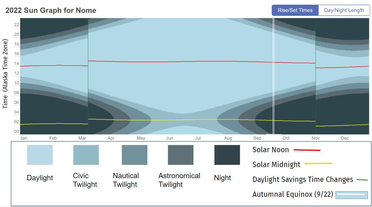
TimeandDate.com makes sun graphs of any location in the world. These graphs show the length and time of daylight, twilight and night over the course of 2022. We focus on Nome, Alaska, as a location to the north of the state and to the west within the Alaska Time Zone. How does light change over the year? How do we humans adjust our clocks to shape our connections with the natural world and with each other?
This sun graph depicts daylight, twilight, and night throughout 2022 for Nome, Alaska, using a 24 hour clock to show local times, not am and pm. The graph shows how skewed Nome’s clock time is from its solar time. Solar noon in Nome – when the sun is highest in the sky – happens at 14:00 (2:00 pm) in the winter and at 15:00 (3:00 pm) in the summer. Similarly, the darkest part of the night is at 2:00 or 3:00 in the morning, not at midnight.
The graph differentiates among the different types of twilight (specific definitions are in the slide deck). From mid-May through mid-August, the darkest that it gets in Nome is “Civic Twilight” when there is “still enough natural sunlight … that artificial light may not be required to carry out outdoor activities.” The graph also shows how switching over to Daylight Savings Time (in March) and back to Standard time (in November) shifts clock time an hour later and then earlier.
We chose Nome as the main graph because it’s close to the western limit of the Alaska Time Zone (-9 UTC) and so its solar time is particularly skewed. This additional slide shows how sun graphs differ within the Alaska Time Zone at 5 different locations in Alaska, and, for further comparison, Disneyland in California is included.
In looking at these sun graphs simultaneously, we can see that in Unalaska – which is about as far west as Nome – the solar time is equally skewed, but, because it’s further south, they experience astronomical twilight there in the summer months, when it’s dark enough for most celestial objects to be viewed. By contrast, Hyder, to the far east of ADT, experiences solar noon a little early (11:30 am) in the winter and a little late (12:30 pm). (Of course, variation within the hour before and after solar noon is to be expected.) Utqiagvik is in the most northern part of Alaska and its sun graph reflects that – no twilight at all in the summer months and no daylight at all in the winter months. However, Utqiagvik is not as far west as Nome, and its solar noon is less “off” (about 1:00 pm in the winter and 2:00 pm in the summer). The sun graphs of Juneau and Fairbanks reflect their respective locations. Disneyland, far to the south and closer to the equator, experiences much less variation in the amount of daylight each day and much shorter periods of twilight (note: it’s also in a different time zone).
Time zones were initially figured out mathematically (by dividing the earth into 24 zones, one for each hour of the day, beginning in Greenwich, England, and then radiating out along longitudinal lines). They were then significantly adjusted to accommodate political boundaries and geographic landmarks. Since then, individual political entities (e.g., countries, states, and/or provinces) have been deciding for themselves how and where they want to adopt those time zones and during which part(s) of the year, for their particular boundaries. (Fig.2) Each time zone is described by how it relates (+ or -) to UTC (Universal Time Coordinated). Greenwich, England is 0 UTC.
The contiguous US spans 4 time zones – Eastern (-5 UTC), Central (-6 UTC), Mountain (-7 UTC), and Pacific (-8 UTC). Alaska, given that it is as wide as the contiguous US, also spans the equivalent of 4 time zones. Until as recently as 1983, all 4 time zones were used within Alaska as shown (more or less) in the diagram below Now, all of Alaska is either in Alaska Time (-9 UTC) or Hawaii-Aleutian Time (-10 UTC). The dividing line between time zones within Alaska is just west of Unalaska.
Deciding how to adapt clock time across broad geographic distances has been a complicated and often heated discussion for more than a century at many levels. For many years, each community set its own clocks according to the sun.
“In North America, a coalition of businessmen and scientists decided on time zones, and in 1883, U.S. and Canadian railroads adopted four (Eastern, Central, Mountain and Pacific) to streamline service. The shift was not universally well received. Evangelical Christians were among the strongest opponents, arguing “time came from God and railroads were not to mess with it,”…” (NYTimes)
Similarly, discussions about Standard vs Daylight Savings Time – whether to switch and, if so, which to keep permanent – have raged for decades in the US and elsewhere.
“To farmers, daylight saving time is a disruptive schedule foisted on them by the federal government; a popular myth even blamed them for its existence. To some parents, it’s a nuisance that can throw bedtime into chaos. To the people who run golf courses, gas stations and many retail businesses, it’s great.” (NYTimes)
Most recently, the U.S. Senate voted, in the spring of 2022, to stay on Daylight Savings Time permanently. That bill is currently stalled in the U.S. House. Both Alaska senators voted to make Daylight Savings Time permanent.
In Alaska, the challenges have revolved around how the choice of time zones might unify Alaska, force distant communities to adhere to clock times that adversely affect their daily lives, and/or might further connect or disconnect Alaska from the US West Coast, where much business has centered. During WWII, “Southeast Alaska was put on Pacific Time during World War II to synchronize the state capital with San Francisco and Seattle.” In 1983, when Alaska switched from 4 time zones to 2, some communities chose to stay on Pacific Time to be aligned with the banks and businesses in Seattle (Ketchikan) and to be aligned with the Bureau of Indian Affairs in Portland (Metlakatla). They have since switched over to Alaska Time.
Elsewhere, China, a country even wider than the state of Alaska and spanning 5 time zones, has chosen to keep the entire country on Beijing time since 1949. The Yukon Territory, in 2020, decided to stop switching from daylight to standard time. They are now permanently at -7 UTC. That means that in the summer, they are one hour ahead of Alaska (i.e., they are aligned with Pacific Daylight Time) and in the winter, they are two hours ahead of Alaska (i.e., they are aligned with Mountain Standard Time)
What do you think?
How do daylight hours in Nome align similarly or differently from where you are? Why?
How does Daylight Savings Time (March-November) impact you, if at all?
Would you rather more daylight in the morning year-round (that’d be Standard Time, like now, late November) or would you prefer more daylight in the afternoon/evening year-round (that’d be Daylight Savings Time, like in summer and early fall)?
If you were to choose either Daylight Savings Time or Standard Time to make permanent for the entire country, which would you choose and why? Who might have a different preference and why?
If you were in charge of Time Zones for Alaska, how many would you choose? Which ones?
Or, should we have Time Zones at all? Are there alternatives?
There’s lots of fascinating history behind the creation of and disagreements around Time Zones and Daylight Savings Time at world, national and state levels. We’ve included several very readable articles in resources; check them out.
Finally, one more note that may clear up some questions:
The Prime Meridian (0°longitude) and the Ante Meridian (180°longitude) “divide” the earth into the western and eastern hemispheres. Most of Alaska is east of the 180th meridian, but parts (e.g., Attu) are west of the 180th meridian; that means that Alaska is the state that is, technically (mathematically), both farthest west and farthest east! The International Date Line runs roughly along the 180th meridian, but because it’s a political construct, people have adjusted it to run west of (rather than through) Alaska and so all of Alaska (and the US) remain in the same date.
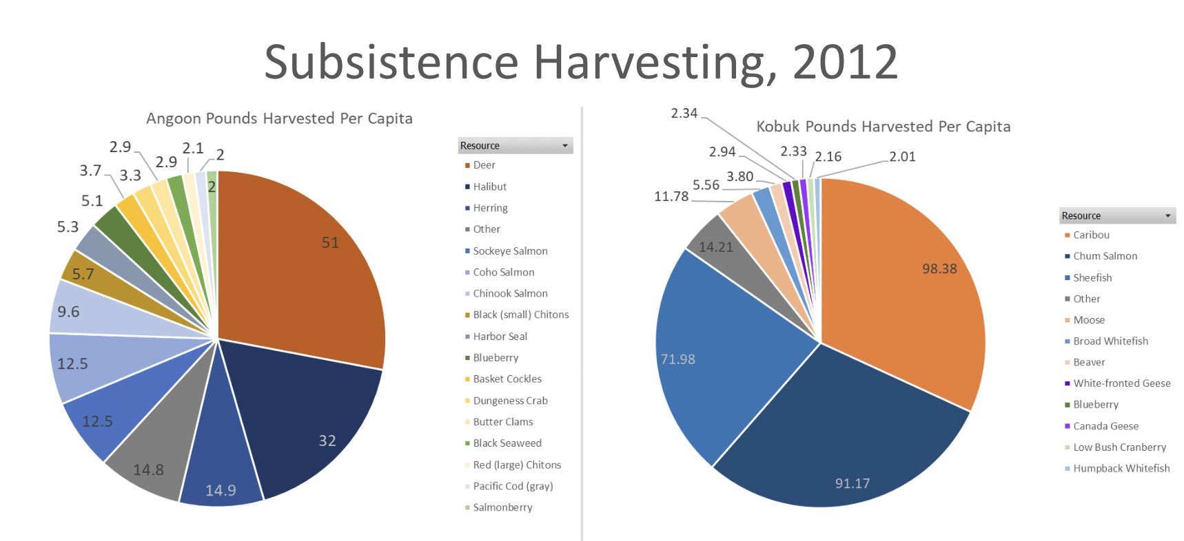
(So many great) Student Suggestions for Catchy Headlines: “The Pie Food,” “Alaska’s Meat Pie Charts,” “Animals That Die the Most,” “Wild Foods We Use,” “The Harvesting of Two Places,” “The Harvests of Alaska,” “Surf and Turf in Alaska,” and “Alaska’s Different Diets.”
These graphs show the subsistence harvest of two villages in Alaska based on household samples conducted by the Alaska Department of Fish and Game, Subsistence Division. Harvest is converted to pounds for consistency in comparison.
Subsistence harvesting is a crucial way of life for many Alaskan Natives. Alaska state law and federal law define subsistence uses as the “customary and traditional” uses of wild resources for various uses including food, shelter, fuel, clothing, tools, transportation, handicrafts, sharing, barter, and customary trade. To determine if a resource is associated with subsistence, there are eight criteria Alaska Department of Fish and Game look at. They are: length and consistency of use; seasonality; methods and means of harvest; geographic areas; means of handling, preparing, preserving, and storing; intergenerational transmission of knowledge, skills, values, and lore; distribution and exchange; diversity of resources in an area; economic, cultural, social, and nutritional elements.
Angoon and Kobuk both display a large amount of subsistence harvesting. Angoon displays a much broader diversity of food then Kobuk. Kobuk, however, has a much larger amount of harvesting per person. Interestingly, both communities do the majority of their harvesting of fish (many different types), but their largest single resources are land mammals (deer in Angoon and caribou in Kobuk). There is virtually no overlap in what resources they are collecting though. This is due to the vastly different climate Angoon has in the Southeast compared to Kobuk in the Interior.
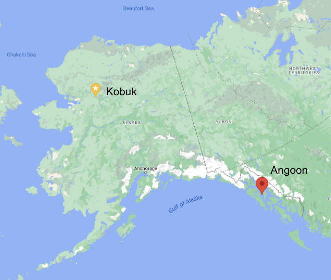
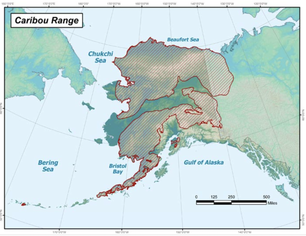
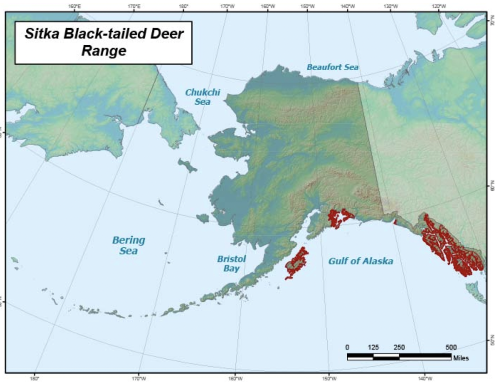
There were lots of questions from students about the range of animals, especially caribou and deer, so we’re adding some maps below and a website for you to research more animals.
Another student noticed that there was more chum salmon harvested in Kobuk than in Angoon. We asked Flynn Casey, who works at ADFG, for more insight on that and he said:
“To start with a simple answer, chum salmon do appear in the Angoon harvest data…. The number for chum is 1.3 pounds per capita. …[A]ny resource that clocks in under 2 pounds per capita gets binned into the ‘other’ category….
It’s also important to remember that the data represents this snapshot in time which could be an outlier in some way(s). For example, 2012 seems to be a year of relatively weak salmon returns compared to prior years during which subsistence harvest data was collected, both for Angoon and Kobuk….
While there are probably several factors relating to that big difference in chum harvest, a little scanning of the relevant tech papers (399 for Angoon; 402 for Kobuk) suggests that it is largely driven by how much each community targets chum salmon compared to other salmon species. Chum are the only species of salmon to be found in significant quantity near Kobuk (notice no other salmon species shows up in the Kobuk pie chart), so it’s a highly targeted fish. For Angoon, much of the 2012 subsistence fishing effort targeted coho and Chinook salmon, either by trolling or rod-and-reel, in coastal waters. The remaining salmon species can be caught among the same few systems of inside protected waters, but most of the effort there was for sockeye salmon.
*Another interesting factoid from the Kobuk paper: while similar weights of caribou and chum salmon were harvested in 2012… “Many respondents reported that they were not able to adequately dry much of the salmon they harvested because of incessant rain. As a result, households fed spoiled salmon to dogs in order to avoid wasting the resource.””
Finally, several students said they were surprised that there was so much caribou harvested in Kobuk and so little moose, especially because that’s so different from hunting around Fairbanks. They wondered what the graph of Fairbanks would look like. We highly recommend that you look at information below about making a graph about your own community. Email us at juneaustemcoalition@gmail.com with questions – or with your completed graphs. We’d love to add them to this post!
Visualization Source: Craig Fox using Microsoft Excel.
It can be replicated with medium effort and medium technical skill. First determine if the communities you want to use have data by checking the Community Observer Interactive Map of Geographic Survey Data. Only use communities with comprehensive data. For comparison purposes try to only use one village and compare over time, or compare multiple villages in the same year. Once you identify the communities and years you want to use, go to the Community Subsistence Information System. Select “Harvest by Community”, then select the community you would like to view. Select which year you want under “Project Years Available”. Check the box that says “Include Only Primary Species in Download”. Then click “Create Excel File”. Repeat this process for each community or year you want to use. Next download the file below called “Subsistence Harvesting Make Your Own”. Replace the data on the sheet called “Replace with Downloaded Data” with the data you got from the Community Subsistence Information System. Then go to the “Pivot Chart and Graph” tab. Click somewhere on the chart. On the ribbon at the top, a new option called “PivotTable Analyze” will appear. Select that and then click “Refresh”. The graph will now display the data. Change the title of the graph and update the colors. Repeat this process for each graph you want.
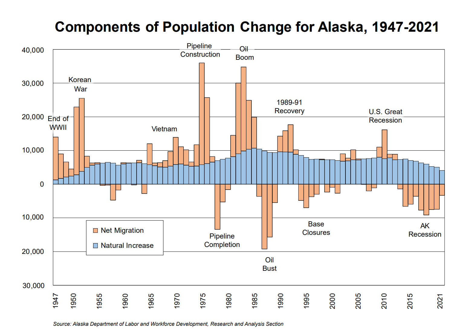
This graph shows the changes in Alaska’s population from 1947 to 2021. The blue shows the natural increase, (the difference between births and deaths) and the orange shows the net migration (the difference between people moving in and moving out). The natural increase gradually rises and falls over the last 55 years. The net migration varies wildly from high positive migration (people moving in) to high negative migration (people moving out). This graph shows how migration and natural increase each changed independently.
How can you use this graph to figure out whether the overall population in Alaska increased or decreased in any particular year?
Overall population increases if either the net migration for that year is above 0 (see, for example, 1950) or, if there is a net migration below 0, if that net migration is less than the natural increase (see, for example, 2000). Recently, the overall population in Alaska has been decreasing, but increased in 2021 for the first time since 2016. That increase was due, primarily, to the influx of new personnel and their families to Eielson Air Force Base near Fairbanks.
Among the many catchy and informative headlines suggested by students for this graph are: “The Ups and Downs of Alaska;” “Those Who Came and Went;” and “The Population’s Love, Hate Relationship with Alaska, 1947-2021.”
There were many thoughtful and curious observations and questions posed by students and great connections to their own lives and families. We’ve answered some questions below and will do more research with experts to answer others.
Many students wondered why there was an increase in migration to Alaska during wars. In general, that’s because of Alaska’s location which is closer to Asia (where those wars were) than the rest of the U.S. is. Alaska has been an important military jumping off point for troops and planes since WWII. Eielson Air Force Base, for instance, southeast of Fairbanks, was established in 1943. Anchorage was a relatively small town prior to WWII and grew exponentially with the construction of Fort Richardson (Army) and Elmendorf Air Force Base in 1940-41. After the wars, when far fewer active duty soldiers were needed, many returned to their original homes; others, though, chose to stay in Alaska and create new homes here.
The oil industry has provided the other major booms and busts in Alaska population:
“Since statehood [1959], natural increase has provided Alaska with steady growth. In- and out-migration have been far more uncertain components of this population change, as the numbers of people moving into and out of the state have swung from year to year. The discovery of oil in Prudhoe Bay in 1968 and the subsequent construction of the Trans-Alaska Oil Pipeline in the 1970s reshaped Alaska’s population, immediately and in the following decades. Tens of thousands of workers and their dependents poured into the state for the construction of the pipeline, and many left upon completion. In the years that followed, a huge number of migrants flowed into Alaska with new oil revenue and higher oil prices, but a large number left when oil prices plunged in 1985.” Alaska Population Projections: 2021 to 2050, Alaska Department of Labor and Workforce Development, Research and Analysis Section
That article also provides more details about birth and death rates across the state.
“Alaska’s projected crude birth rate (the number of births per 1,000 people) for 2021-2022 is 13.0. With the aging of Alaska’s population, this figure is projected to decline to approximately 11.9 by 2050. Birth rates vary greatly across areas. The highest crude birth rates in 2021 were in the Kusilvak Census Area (27.4), Northwest Arctic Borough (23.6), and Bethel Census Area (21.4). The lowest birth rates were found along the Aleutian chain and primarily in Southeast Alaska. In the Aleutians East Borough and Aleutians West Census Area, where much of the population lives in group quarters for fishing and fish processing, the crude birth rates were 2.0 and 5.4, respectively. Other areas with low birth rates included the Haines Borough (6.9), Bristol Bay Borough (8.5), City and Borough of Juneau (8.6), and Petersburg Borough (8.9). …
Alaska’s crude death rate (the number of deaths per 1,000 people) in 2021 was 7.3. The greatest contributing factor was the ratio of senior citizens to the overall population. Like crude birth rates, crude death rates vary by area. The highest 2021 rates were in the Prince of Wales-Hyder Census Area (15.4), City and Borough of Wrangell (12.4), and Copper River Census Area (11.8). Those with the lowest crude death rates included the Aleutians West Census Area (2.7), Aleutians East Borough (2.8), and City and Borough of Yakutat (2.9). As Alaska’s population ages over the projection period, crude death rates will likely increase in all boroughs and census areas.” Alaska Population Projections: 2021 to 2050, Alaska Department of Labor and Workforce Development, Research and Analysis Section
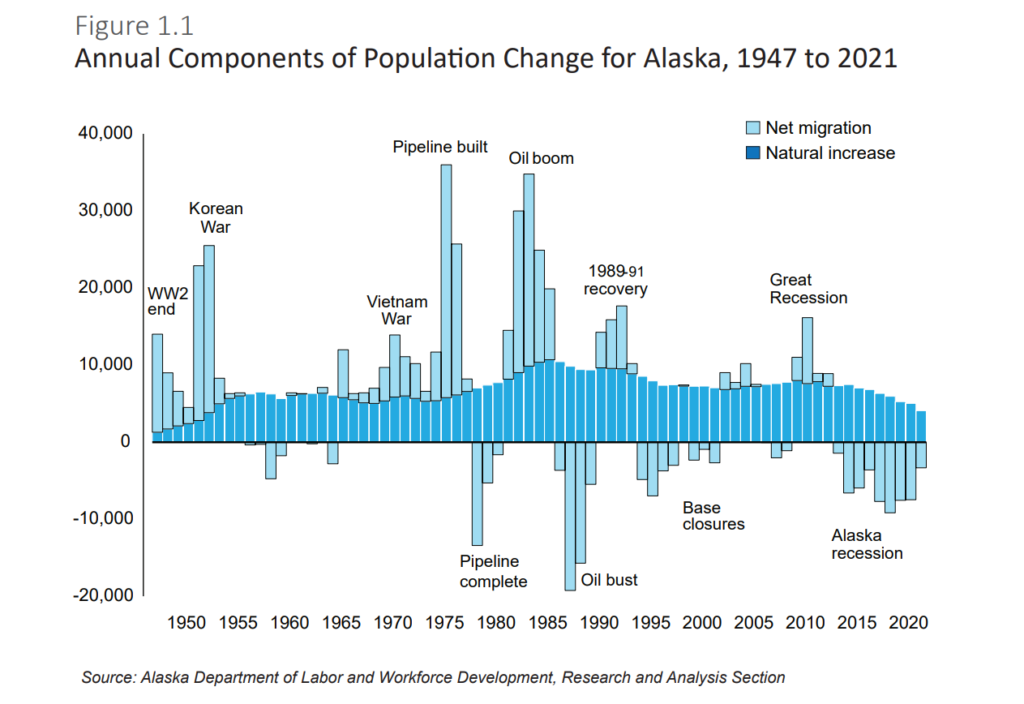
Below is a second version of the Population Change graph. It was actually in the original publication, Alaska Population Projections, 2021 to 2050, while the first was a stand-alone pdf. As several students noted, the version we published on the website doesn’t have negative numbers for the numbers below 0. Interestingly, this original graph does! What other differences do you notice? Which changes do you think make the ideas more or less clear?
Other questions from students to continue to think about and research:
What would it look like if this graph were extended back to earlier times, such as the Gold Rush, European colonization, or original Alaska Native settlement?
Why were negative numbers bigger than the positive numbers?
Why did so many people leave in the 2000’s?
Why did the natural population rise more during the Oil Boom than at any other time?
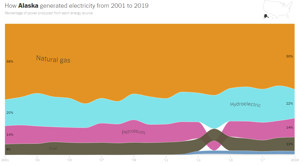
Students’ suggestions for catchy graph titles: “Powering Alaska,” “A Heated Topic”, “Electricity and Alaska.”
This graph shows Alaska’s electricity generation since 2001. It is based on data reported to the United States Energy Information Administration. It shows the relative percentages of each form of electricity generation.
Electricity can be generated using different methods. One way to generate electricity is by burning fossil fuels. Burning these fuels releases heat that can boil water to create steam. The steam turns turbines that can power an energy grid. A less efficient method of converting fossil fuel to electricity is necessary in smaller power plants and backup generators throughout Alaska; there, diesel engines or diesel-fired turbines are used. Petroleum (oil), natural gas, and coal fall into the category of fossil fuels. This type of energy production releases carbon dioxide and other greenhouse gasses into the atmosphere, contributing to climate change.
There is also renewable energy, which uses the natural world around us to produce energy. Hydropower harnesses the kinetic energy from flowing water. In Southeast we have relatively low flow, but lots of “head pressure.” In the lower 48, the large river system hydro plants rely more on flow. Wind turbines, powered by moving air, use the energy from wind in motion. Photovoltaic solar panels absorb solar energy from the Sun, converting it to electricity that we can use. Around 5-20% of the solar energy is converted to electricity. Geothermal energy uses the heat from the Earth’s core to create electricity, usually by powering a steam turbine.
This graph shows the different energy sources used to generate electricity in Alaska from 2001 to 2019. Note that this graph shows energy generation, the conversion of a fuel source (diesel, wind, etc) to electric energy. This is different from electricity consumption. Because of Alaska’s geography, its electrical grids are disconnected from the rest of the United States and Canada. This means that no electricity is imported to or exported from Alaska. Other states, by contrast, may generate as little as 2/5 of the electricity that they actually consume. In Southeast Alaska, the only communities connected to one another are Prince of Wales Island, Ketchikan-Wrangell-Petersburg, and the Haines-Chilkat Valley. It is also important to note that this graph only shows which energy sources produce electricity. Alaska produces additional energy, mainly through oil, but the vast majority is not used for electricity generation in Alaska. The crude oil is shipped out of state to be refined and then shipped back to Alaska for various uses including space heating and transportation.
Since 2001, Alaska’s electrical grid has mostly been powered by natural gas. In 2019, natural gas powered 50% of Alaska’s electricity. Large metro areas like Anchorage, the Matanuska Valley and the Kenai Peninsula use mostly natural gas. The second biggest contributor to Alaska’s electrical grid is hydropower, which powered 22% of Alaska’s electricity in 2019. Hydropower is most common in Southeast and Southcentral regions. Petroleum (14% in 2019) and coal (11% in 2019) come next. Smaller villages mostly use petroleum. Coal is used to generate electricity in Fairbanks. Wind power systems have been developed along the coast, along the road system and in remote areas.
Alaska went from having 11 wind turbines to having 59 in 2012, when advancements in technology made the construction of wind turbines more cost effective. The rise in wind power was also due in part to federal tax incentives. The incentives did not have as big an impact in Alaska as in other states because most of the utilities in Alaska are nonprofits and do not pay income taxes. There were two wind projects – one in Anchorage and one in Fairbanks – that were built by developers who did take advantage of the tax credits.
Direct federal funds have had some impact on increasing the use of renewable resources in Alaska. It was a federal grant that paid for a transmission line to connect Greens Creek Mine to Juneau’s electric system (dramatically reducing diesel usage by the mine.) The state of Alaska set up a Renewable Energy Fund in 2008 which has since funded a number of electric generation projects.
Looking ahead, the new federal infrastructure bill is written to make certain tax credits refundable for municipal utilities and coops, which will open other opportunities. Furthermore, with oil prices high again, the state is again putting money into the REF Grant program.
In 2014, petroleum usage fell. Coal usage remained constant, but the decrease in petroleum meant that coal became a larger percent. However this was temporary. The reason that the coal and petroleum areas switched places on the graph is that the colored bands are ordered from highest percent to lowest percent, and during 2014, petroleum’s percent was briefly lower than coal’s percent. Frankly, we’re still trying to figure out what caused that dip in petroleum.
Do you think this graph is easy to understand? If so, what makes it easy? If not, what aspects of the graph do you think are confusing or unnecessary?