
WGOITAG is a service that the Juneau STEM Coalition is creating with and for Alaska educators and community members. Our goal is to provide strategies and Alaska-based graphs that will be engaging and relevant to students and stimulate them to think and feel deeply, and to communicate clearly. We mimic heavily and gratefully both the NYTimes “What’s Going On in This Graph?” framework and Jenna Laib’s “Slow Reveal Graphs.” Thanks to Jenny Strumfeld for making this Notetaker from Jenna’s prompts.
Learn more here
View the complete database here
Help us develop “What’s Going On in This Alaska Graph?” In addition to responding to the questions:
- What do you notice?
- What do you wonder?
- How does this relate to you and your community?
- What’s going on in this graph? Create a catchy headline that captures the graph’s main idea.
Please also tell us:
- Would you recommend that other classes use this graph?
- Why or why not?
- Do you have suggestions for how to improve it?
Do you have a graph you want to share? Submit here
Graph SubmissionData Accessible (10) Energy (1) Environment (5) Government (4) Health (2) Local (8) State (8) Visualization Recreatable (9)
-
Housing Shortage
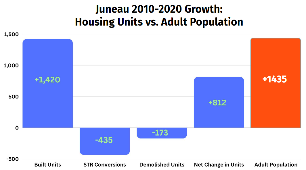
Most of Alaska is facing a housing crisis now: there’s not enough housing available and what is available is too expensive for many people. Why? In Juneau, summer of 2022, there was a theory circulating that the problem resulted in part from landlords converting their traditional, long-term rentals to “short-term rentals” (such as Airbnb) because…
-
Daylight
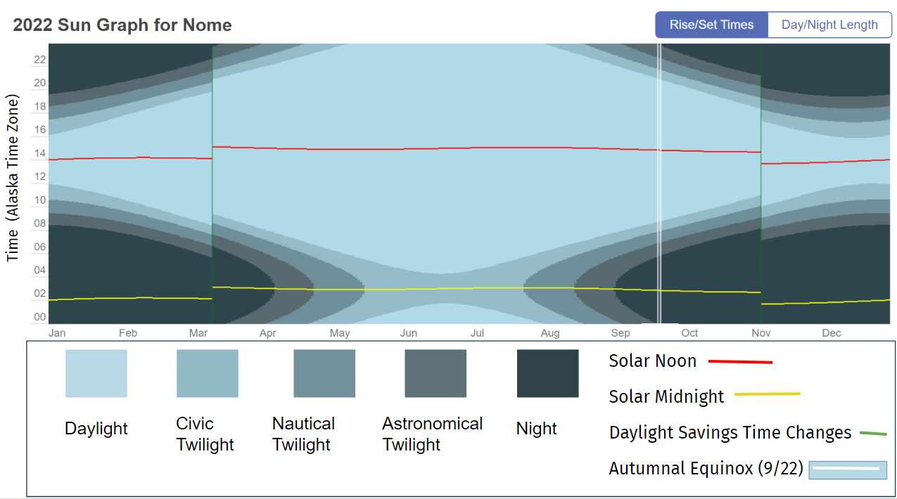
TimeandDate.com makes sun graphs of any location in the world. These graphs show the length and time of daylight, twilight and night over the course of 2022. We focus on Nome, Alaska, as a location to the north of the state and to the west within the Alaska Time Zone. How does light change over…
-
Exercise Heatmap
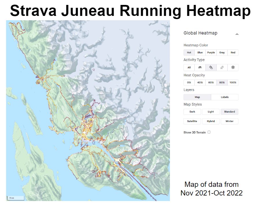
Strava, one of the most popular exercise apps, has a heatmap of all exercise done over the past year. It shows where people are recording workouts and the paths they are taking. You can also filter by activity type to see the differences between biking, running, winter, and water activities.
-
Social Connectedness in America
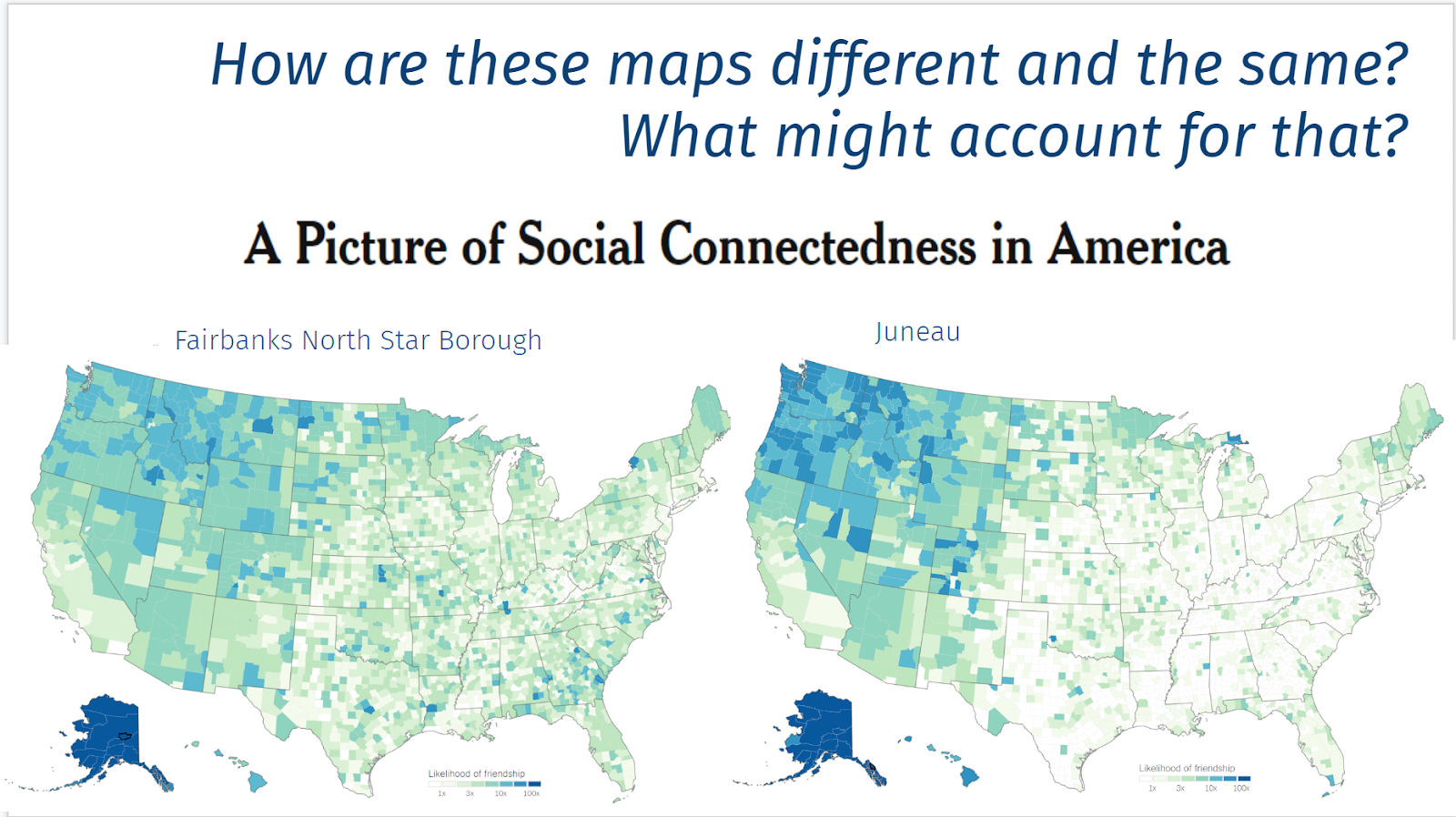
Both maps show equally strong connectedness from their respective communities to the rest of Alaska (with the exception of Kusilvak, which is more closely connected to Fairbanks than to Juneau). Fairbanks, though, is much more broadly connected to the lower 48 states than Juneau is (the colors are more evenly diffused throughout the US in…
-
Subsistence Harvesting
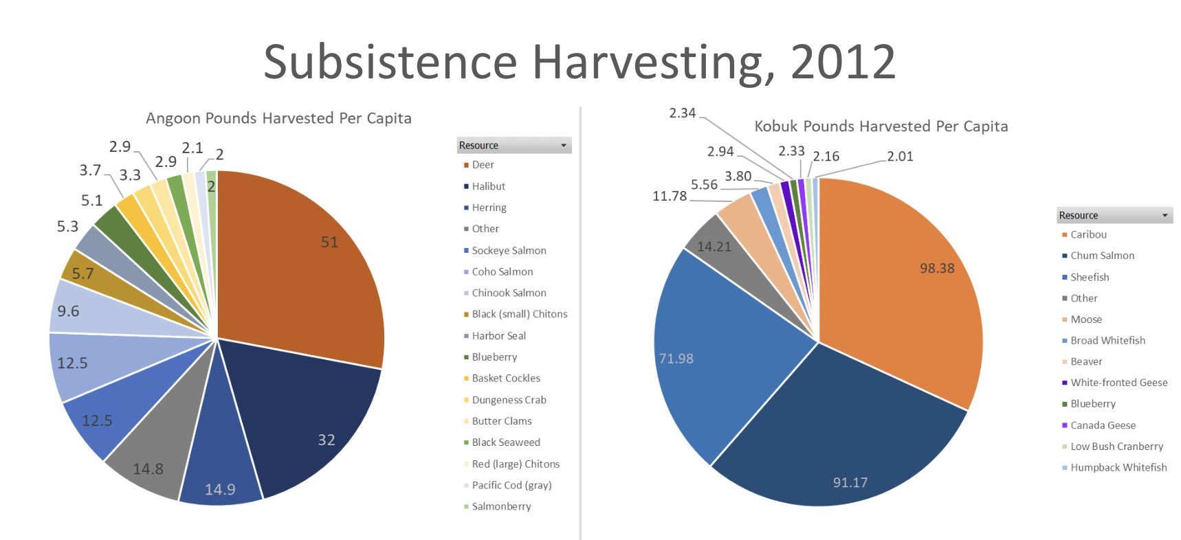
These graphs show the subsistence harvest of two villages in Alaska based on household samples conducted by the Alaska Department of Fish and Game, Subsistence Division. Harvest is converted to pounds for consistency in comparison.
-
Population Change
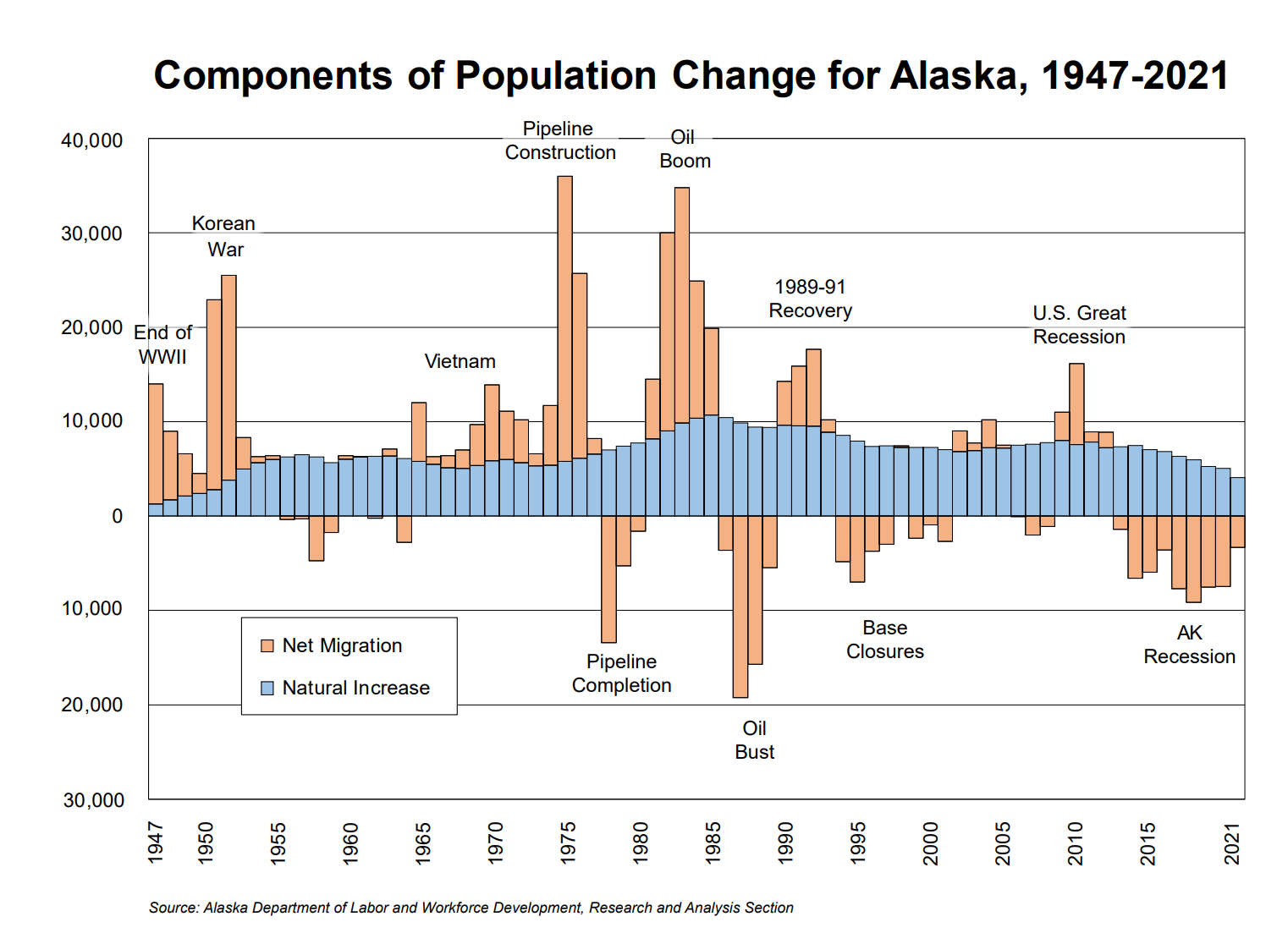
This graph shows the changes in Alaska’s population from 1947 to 2021. The blue shows the natural increase, (the difference between births and deaths) and the orange shows the net migration (the difference between people moving in and moving out). The natural increase gradually rises and falls over the last 55 years. The net migration…
-
Electricity Sources
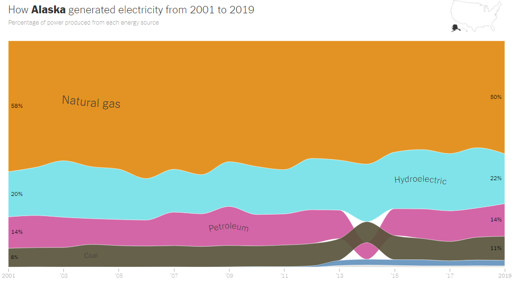
This graph shows Alaska’s electricity generation since 2001. It is based on data reported to the United States Energy Information Administration. It shows the relative percentages of each form of electricity generation.