
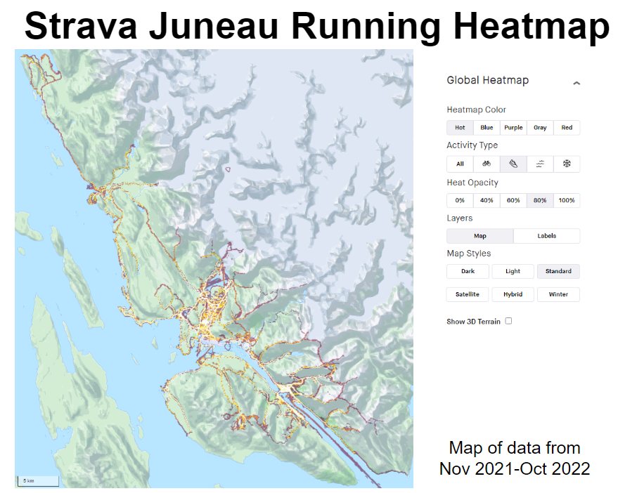
Notice, Wonder, Connect Juneau
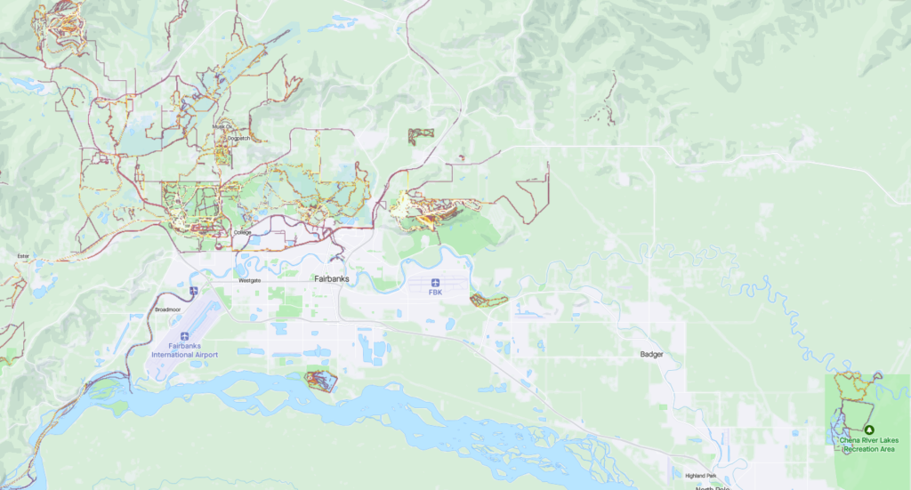
Notice, Wonder, Connect Fairbanks
Strava, one of the most popular exercise apps, has a heatmap of all exercise done over the past year. It shows where people are recording workouts and the paths they are taking. You can also filter by activity type to see the differences between biking, running, winter, and water activities.
Physical activity is happening every day all around you. From biking to school or work to walking downtown to skiing at the slopes to swimming on a lake, we are moving around for fun, exercise, and jobs. All of this activity is not evenly distributed though. Many people use the Strava app to record their exercise so that they can compare their activity over time. Strava users have the option to make their data visible to anyone or just to select friend groups. Strava uses the public data to create these heatmaps so everyone can find trends.
Who do you think might use these heat maps and why?
Strava puts each activity into one of four activity types. When users click on their recording devices, they mark what type of activity they’ve done. Strava uses complicated algorithms to screen/filter out data that they think doesn’t fit. For example they remove data that appears too fast for a specific activity. What are the advantages and disadvantages of this filtering?
- Ride: Ride, Handcycle, Wheelchair, Velomobile, E-Bike Ride, Mountain Bike Ride, Gravel Bike Ride, E-Mountain Bike Ride, Skateboard
- Run: Run, Walk, Hike, Rock Climbing, Trail Run
- Water: Swim, Kitesurf, Windsurf, Kayaking, Rowing, Stand Up Paddling, Surfing, Canoeing, Sailing
- Winter: Alpine Ski, Ice Skate, Backcountry Ski, Nordic Ski, Snowboard, Snowshoe, Winter Sport
Look at the map and see how usage varies by these activity types. What trends can you find? Can you identify any local landmarks by comparing the popularity of different activity types? In some cases, this will depend on your climate.
If we look at Juneau, we can clearly see a spike of winter activity at Eaglecrest Ski Area.

However, Fairbanks with its colder climate has a much more dispersed winter activities.
If we look at water activities, we can find similar patterns


Both Juneau and Fairbanks see a spike of water activities around docks and other launch sites. In Juneau this corresponds to North Douglas Launch Ramp, Auke Lake, and most noticeably Mendenhall Lake (a popular tourist destination). For Fairbanks, Chena River Lakes Recreation Area launch sites (in the east side), Tanana Lakes Recreation Area launch sites (in the south central side), and launch sites along the Chena River are major spots.
The Strava Heatmap is composed of public data collected from Strava users’ recorded workouts from the past year. Currently over 100 million people use Strava. Are these people an accurate representation of the average person? What groups do you think are over or under-represented? What about these workouts? Do you think everyone records all the activities they do? What types are more likely to be recorded and made public? This might be useful data for trail planners trying to determine which routes to focus on. Meanwhile, city planners might find the data overrepresenting certain ethnicities and therefore not accurate enough for determining where to put bike lanes. Only using data from the past year presents another conundrum. On one hand, old roads or former trails will disappear from view more quickly, allowing them to recover from overuse. Routes that change seasonally are also impacted. Do you know of any trails in your community that might disappear on the heatmap because of this?
For a point to appear on the graph, multiple people have to have walked along it. The brightness is then determined by how many people used that path compared to other nearby routes. The colors are then distorted to make them more evenly distributed. This magnifies small differences. What this means is that what is really bright in one location is not equivalent in popularity to really bright in a different area. It also means that something twice as bright is not necessarily twice as popular. Strava chose this methodology to provide a more visually appealing image. What do you think about this choice? While the picture may look nicer, someone who has not read the details might think a trail is more popular than it is.
What are some of the consequences of having all of this data available? Some people use this to find new trails close to their home or when they visit someplace new. The danger is that they might not have properly researched a route and go in unprepared, especially if that route is seasonally dependent. For example, some years Mendenhall Lake in Juneau freezes over and can be walked across safely. Someone unfamiliar with the lake might assume it is always safe to cross and end up falling into it and getting hypothermia. It can also lead to more people following a path they see on Strava that is not an official trail. Over time this can greatly degrade the route and cause harm to the environment.
Online publicly available user data can often cause unintentional harm. For example, several years ago, Strava heat maps were used to identify foreign military bases and common patrol routes. Furthermore, even though Strava anonymized their data, individuals were able to connect it with other Strava and outside data sources to figure out who the people running these routes were, where they lived, and what other locations they frequented. Obviously this poses a huge security and privacy risk for both the military and the individuals. How do we balance freedom of information with the safety concerns of this information? Published speed records like what Strava has for their routes can encourage risky behavior. On particularly dangerous routes, runners are incentivized to perform risky moves in order to save on time. Not only does this risk their health, but it also can force emergency services to go into dangerous conditions to rescue them.
Additional Resources:
- Heatmap Updates, Strava – A brief overview of the heatmap and recent changes
- Heatmap Galleries, Strava – A collection of some global observations made using the heatmap
- Building the Global Heatmap, Strava – A more technical paper detailing the computational creation of the map, ideal for high school computer science classes
- Articles about the military privacy concerns with the Strava Global Heatmap
- https://www.bbc.com/news/technology-42853072
- https://www.wired.com/story/strava-heat-map-military-bases-fitness-trackers-privacy/
- https://www.theguardian.com/world/2018/jan/28/fitness-tracking-app-gives-away-location-of-secret-us-army-bases
- https://www.nytimes.com/2018/01/29/world/middleeast/strava-heat-map.html
Visualization Type: Heatmap
Data Source: Strava Data (proprietary)
Visualization Source: Strava Global Heatmap
It can easily be replicated. Go to the Strava Heatmap, select the activity type you want to see, and zoom into the area you want to see.